
Web Interface Design for Startups: A Practical Guide

Outrank AI

Your AI product works. The algorithm is strong, the funding is in place, and the team has built something users genuinely need. Then a prospect visits the marketing site, signs up, opens the dashboard, and encounters three different visual languages, inconsistent controls, unclear labels, and a mobile experience that feels like an afterthought.
That gap creates doubt before the product has a chance to prove itself. Web interface design is the discipline that closes it by aligning product structure, brand expression, interaction behavior, accessibility, and frontend code in one usable system.
Table of Contents
The Hidden Cost of Disjointed Interfaces
A founder at an AI SaaS company often sees the problem in fragments. Marketing owns a polished website. Product has a functional dashboard assembled around engineering priorities. A freelance brand designer has supplied colors and type. The frontend team has implemented components under deadline pressure. Each piece works on its own, but the whole experience feels stitched together.
The pricing page promises simplicity, while the product asks new users to interpret unfamiliar terms. Buttons change shape between the website and the app. A status shown in purple on one screen appears as blue on another. On mobile, the dashboard hides actions behind horizontal scrolling. Users don't know whether the inconsistency signals a temporary rough edge or a deeper problem with the product.

Friction appears before users can describe it
Disjointed interfaces increase the work users must do to understand a product. They pause at unfamiliar controls, question whether a field is safe to complete, and hesitate before committing an important action. In fintech, that hesitation can affect account activation or payment completion. In Web3, it can make a wallet or transaction flow feel dangerous. In AI SaaS, it can make a capable system appear unreliable.
The issue isn't that every screen needs to look identical. A marketing page and a data-heavy workspace have different jobs. The interface needs a shared foundation, including hierarchy, language, spacing, color meaning, component behavior, and responsive rules, while allowing each context to do its work.
Practical rule: If users need to relearn the interface on every screen, your team has designed pages, not a product system.
The hidden cost of cheap design for startups is often the rework created by disconnected decisions. Teams redraw components, revise copy after development, and repair responsive behavior late in the release cycle. A unified web interface design process removes those handoffs by connecting brand, product, and implementation from the start.
What Web Interface Design Really Means
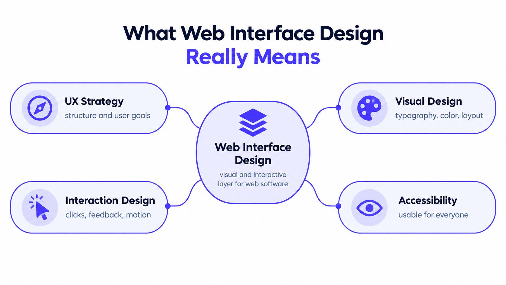
Web interface design is the visual and interactive layer that lets people use software through a browser. It combines UX strategy, visual design, interaction design, responsive architecture, and accessibility. The work isn't limited to choosing colors or arranging cards. It defines what users see, what they can do, what happens after each action, and how the product behaves across devices.
The modern discipline took shape around responsive design. In 2010, designer Ethan Marcotte described an approach based on fluid grids, flexible images, and CSS media queries. Earlier websites commonly assumed a fixed desktop viewport, but smartphones and tablets introduced different screen sizes, orientations, and input methods. Responsive design changed the underlying assumption: the interface should adapt to the user's context rather than force every user into one desktop layout. A history of responsive web design documents this shift and its continuing relevance.
Start with the system, not the page
A strong process connects four decisions:
UX strategy: Define user goals, core journeys, information architecture, and the right level of guidance.
Visual design: Establish typography, color, spacing, hierarchy, and brand expression.
Interaction design: Specify clicks, keyboard behavior, loading states, validation, feedback, motion, and recovery.
Responsive architecture: Decide how navigation, tables, charts, forms, and controls change as available space changes.
A SaaS dashboard might keep the main navigation visible on a wide screen and convert it into a compact control on a phone. A fintech product might preserve exact values and confirmation details on both devices while changing the layout around them. Responsive design isn't desktop UI compressed into a narrow column. It requires prioritizing content, defining breakpoints, setting touch-target rules, and testing real workflows.
Mobile devices accounted for more than 55% of global web traffic by 2023, according to summaries citing StatCounter data in the responsive design history reference above. That makes small-screen usability a mainstream product requirement, not a specialist enhancement.
The best design systems also create consistency without flattening personality. Stripe is known for making complex payment infrastructure feel structured and legible. Linear uses hierarchy, keyboard-friendly workflows, and restrained visual treatment to keep a dense product focused. The lesson isn't to copy either interface. It's to decide which patterns deserve reuse and which moments require emphasis.
For founders working with regulated or information-heavy products, a useful companion resource is this guide to finding website design and CMS for RIAs, especially when content management, trust, and conversion need to work together. A coherent system gives your team a repeatable way to ship new pages and features without starting from a blank canvas. For a deeper look at how that system supports product clarity, see modern user interface design.
The Five Pillars of Usable Interfaces
A polished interface can still fail if users can't complete the task. Usability research evaluated by the U.S. Bureau of Labor Statistics found recurring problems in data-access tools, including insufficient guidance, unclear data naming and database organization, and unsystematic interface organization.
Those failures are common in startup products because teams expose internal terminology, add features faster than they revise navigation, and assume that users understand the system's underlying model. Jakob Nielsen's five usability outcomes provide a practical way to test whether the interface supports real work.
Learning and efficiency
Ease of learning asks whether a new user can understand the first meaningful action without a training session. A new analytics user should know how to add a data source, interpret the first result, and continue from there. Good onboarding doesn't explain every feature. It provides the minimum context needed to create an early success.
Efficiency concerns repeat use. Once users understand the product, frequent tasks should require fewer decisions and less movement. Saved views, sensible defaults, keyboard support, and predictable navigation can matter more than decorative animation.
Memorability and recovery
A memorable interface lets returning users pick up where they left off. Labels should match the user's language, not the internal name of a database table or model pipeline. Consistent placement helps people form reliable expectations, particularly in dashboards where users move between reports, filters, and detail views.
Error recovery deserves equal attention. A payment form should preserve valid information after a failed submission. An AI workflow should let users edit a generated draft before committing it. A Web3 transaction should make the pending state and next available action unmistakable. Recovery turns an error from a dead end into a controlled interruption.
Satisfaction through clarity
Satisfaction doesn't mean adding delight to every screen. It comes from confidence that the product is behaving as expected. Progressive disclosure helps by keeping advanced controls available without presenting every option at once. A first-time user sees the essential path, while an experienced user can reach more powerful settings when needed.
Design test: Ask a person unfamiliar with the product to complete a representative task while you observe. Don't rescue them at the first pause. The hesitation often reveals a naming, hierarchy, or feedback problem that a visual review would miss.
The BLS research paper also reported usability testing with 30 participants, each completing three representative tasks for each website. Its proposed template improved perceived efficiency, memorability, and pleasantness. The useful lesson isn't to treat one test as a universal verdict. It's to evaluate interface quality through task success, comprehension, repeatability, and recovery rather than visual preference alone.
Accessibility as Product Reliability
Accessibility becomes a product problem when a user can't authenticate, submit a form, read a chart, or recover from an error. A compliance score may identify technical defects, but it doesn't prove that someone can complete a critical workflow with a keyboard, screen reader, zoom, or touch device.
The 2025 Web Almanac accessibility report found that only 30% of desktop and mobile pages had sufficient color contrast, while 67% explicitly removed default focus outlines. Only about 24% included detectable skip links, and accessibility-app usage remained near 2% of sites. These figures point to a structural issue. Teams often repair visible symptoms while leaving DOM order, focus behavior, labels, and dynamic updates unresolved.
Build the behavior into components
WCAG 2.2 organizes accessibility around four principles: perceivable, operable, understandable, and resilient. Those principles become practical engineering requirements:
Perceivable status: Don't use color alone to communicate success, danger, or a changed state. Pair color with text, icons, or programmatic labels.
Operable controls: Keep keyboard focus visible and logically ordered. Make pointer targets large enough for accurate touch interaction.
Understandable forms: Give fields explicit labels and write error messages that explain what happened and how to fix it.
Reliable semantics: Ensure buttons, dialogs, tables, charts, and navigation expose meaningful structure to assistive technologies.
WCAG 2.2 requires pointer-input targets to be at least 24 by 24 CSS pixels, unless an exception applies. It also defines requirements for visible keyboard focus, including an indicator area equivalent to a 2-pixel perimeter around the unfocused component and a 3:1 contrast ratio against the unfocused state. These are design-system rules, not details to leave to individual frontend judgment. See the design requirements for accessibility for a practical product perspective.
Automated checks can catch missing accessible names, contrast failures, and some keyboard issues. They won't reliably tell you whether focus returns to the right control after a modal closes, whether a route change announces itself, or whether a complex chart makes sense through a screen reader.
Test the task, not just the page
Run manual keyboard tests through onboarding, authentication, payment, account recovery, and the primary product workflow. Test zoom up to 200%, as required by WCAG guidance, without losing content or functionality. Check reduced-motion behavior, touch spacing, focus restoration after route changes, error announcements, and the reading order of dynamic dashboards.
For a fintech founder, this approach protects access to essential services. For an AI SaaS team, it makes alerts, generated content, and review actions more dependable. Accessibility strengthens the product for everyone because clear focus, useful errors, and stable layouts reduce mistakes across devices and contexts.
Measuring Interface Performance
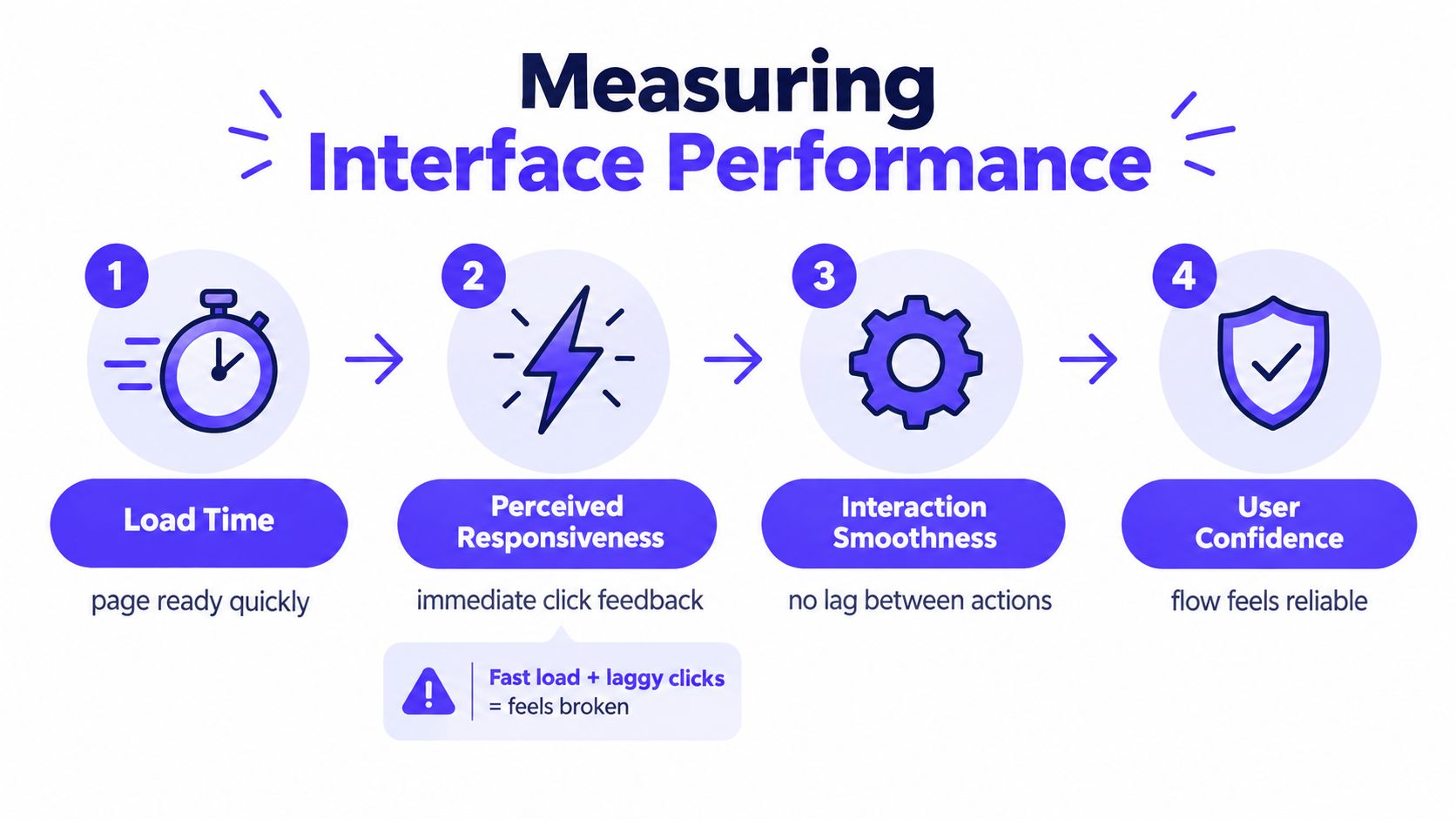
A page can load quickly and still feel broken. Users notice delayed click feedback, shifting controls, stalled search results, and dashboards that appear ready before their data is actually usable. Performance belongs in product design because responsiveness changes whether users trust the interface.
A benchmarking study of 50 publicly available applications across e-commerce, education, healthcare, finance, and entertainment combined task-based usability testing, Lighthouse performance logging, and System Usability Scale surveys. The study found visible sector differences in task success, load time, and perceived satisfaction, as described in its application performance benchmarking study.
Instrument the journeys that matter
Don't limit testing to the homepage. A SaaS team should measure sign-up, authentication, dashboard rendering, search, and primary workflow completion. A fintech team should include payment, verification, account funding, and error recovery. An AI product should measure the time from submitting a request to receiving usable feedback, along with the behavior of cancel, retry, and edit actions.
Track related signals together:
Load time: When is the page ready for meaningful work?
Interaction responsiveness: Does the interface acknowledge a click or tap immediately?
Task success: Can users complete the intended action without assistance?
Error frequency: Where do users encounter validation, network, or system failures?
Satisfaction: Does the flow feel clear and dependable after completion?
A fast interface that creates errors isn't a successful interface. Likewise, a smooth animation can't compensate for a confusing checkout or an unclear permission request.
Set budgets before implementation
Performance budgets work best when designers and engineers agree on them before building. Review the largest content element, blocking scripts, image payloads, layout stability, and data-heavy components. Enforce the agreed limits in continuous integration with Lighthouse or an equivalent test, then validate the results with real-user data.
Laboratory testing provides a controlled signal, but real users bring different devices, networks, browsers, and locations. Compare both sources instead of treating one as definitive. The most productive workflow keeps interface structure, frontend implementation, and usability testing in one loop.
Measure the complete experience: A dashboard isn't performant because its shell appears quickly. It performs well when a user can identify the current state, interact with the right control, and complete the next action without waiting or second-guessing.
Building for AI and Fintech Trust
AI SaaS and fintech products ask users to act under uncertainty. An AI system may generate a recommendation that needs review. A financial interface may display information that affects a payment or account decision. In both cases, visual polish can make the experience more appealing, but polish alone doesn't tell users when to trust the system.
A 2025 review in IEEE Computer Society, reporting Google DORA survey findings, stated that 39% of developers outside Google trusted AI-output quality only a little or not at all. The same discussion links trust to interface intrusiveness, smooth operation, and the user's sense of control in its review of AI and software development.
Compare polish with calibrated control
An anthropomorphic assistant can feel approachable, but a confident tone or friendly avatar may cause users to overestimate the reliability of uncertain output. A dense technical interface can expose every detail, but forcing users to interpret raw system information doesn't automatically create transparency.
Trust-calibrated design sits between those extremes. It gives users enough evidence and control to decide what to do next:
Qualify confidence: Explain uncertainty in plain language instead of presenting every recommendation as final.
Show provenance: Distinguish generated information from verified data, and provide citations that open to inspectable evidence.
Preserve reversibility: Use previews, editable drafts, confirmation steps, and undo actions before consequential changes.
Expose permissions: Make clear what data the system can access, what action it will take, and what remains under user control.
Support escalation: Let users switch to a deterministic workflow or request human review when the stakes require it.
For fintech, this might mean showing fees, source data, and the exact final action before confirmation. For AI SaaS, it could mean separating a model suggestion from a saved record, allowing edits before publication, and displaying the model or workflow version where that context matters.
A unified design partner can compare these choices across brand, product, and code. In-house specialists may go deeper into a single domain, while a cross-disciplinary partner can spot where a brand promise conflicts with an actual permission flow or where a polished prototype fails under real data. The right question isn't whether the interface looks intelligent. It's whether users understand its limits and can recover when it gets something wrong.
Choosing a Design Partner for Speed and Quality
A startup can hire a product designer, a brand designer, and a frontend developer separately. That model offers direct internal ownership, but it also creates three recruiting processes, three working styles, and several handoffs before a decision reaches production. Domain knowledge grows over time, yet early teams often need a coherent product and brand system before they have the capacity to build that structure internally.
A unified creative partner changes the operating model. Instead of handing a brand direction to product, product screens to frontend, and implementation questions back to design, one team carries the decision from strategy through shipped pixels. That doesn't remove the need for founder input. It reduces the number of places where intent can be lost.
What each model trades
Approach | Strength | Trade-off |
|---|---|---|
Separate hires | Internal context and long-term ownership | More coordination, recruiting overhead, and handoff risk |
Traditional agency | External expertise and defined project delivery | Brand, product, and code may still sit in separate workstreams |
Unified creative partner | One system across strategy, design, and frontend implementation | Requires clear decisions, access to the product context, and active collaboration |
925 Studios is positioned as one creative partner that replaces three hires, a product designer, a brand designer, and a frontend developer. Its work covers UI/UX and product design, website design and development, brand identity, and design systems for AI SaaS, Web3, and fintech companies.
The practical advantage appears in ordinary delivery decisions. When a designer specifies a dashboard component, the person implementing it can resolve responsive behavior immediately. When a brand team defines a visual direction, the product team can test whether it survives dense tables, error states, and mobile navigation. When a conversion page needs a new section, the team can consider the CMS, interaction, content hierarchy, and frontend constraints together.
Reduce interaction cost
Checkout research makes the cost of unnecessary complexity visible. Baymard found that 17% of online shoppers had abandoned an order because the checkout was too long or complicated. Its usability testing found that an effective checkout can be reduced to 12 to 14 form elements, while the average U.S. ecommerce checkout presents 23.48 elements by default, according to Baymard's checkout UX statistics.
The same principle applies to startup onboarding, account setup, and upgrade flows. Remove fields that don't support the immediate goal. Group related information. Show the commitment, billing cadence, permissions, or final price before asking users to proceed. Preserve entered information when an error occurs.
A design partner doesn't make those decisions automatically. The value comes from having strategy, visual design, interaction design, and implementation examine the same user journey together. That coordination helps founders ship a coherent interface without assembling and managing three separate functions before the product has reached its next stage.
925 Studios helps AI SaaS, Web3, and fintech teams align brand identity, product UI/UX, design systems, and frontend implementation in one workflow. If your marketing site and product feel disconnected, visit 925 studios to discuss a web interface design system that turns complex workflows into clear, conversion-focused experiences.
Let’s keep in touch.
Discover more about high-performance web design. Follow us on Twitter and Instagram.

