
Search Field Design: Patterns That Actually Convert

Outrank AI

A search field can change how many people use search without changing the search engine at all. In 2001, Jakob Nielsen reported that replacing a homepage search link with a visible, type-in field increased search-engine use by 91% on the Useit.com homepage (Nielsen's findings on visible search). That's a blunt lesson for founders: before investing in smarter ranking, make sure people can find and use the search you already have.
Search is often where a customer arrives with a specific need: find a transaction, understand an error, locate a setting, or ask an AI product for an outcome. If the field is hidden, cramped, or forgetful, that customer has to work around your interface instead of getting value from it.
Table of Contents
Why Most Search Fields Underperform
A search field that users can't find can't help them. Hiding it behind a magnifying-glass icon or burying it in a menu may look tidy, but it adds a step precisely where a customer is trying to move directly to an answer. Nielsen's result shows how much visibility alone can matter. It doesn't prove that every product will see the same lift, but it does make one thing clear: discoverability is part of search performance, not decoration.

The same problem looks different across products. In a SaaS dashboard, a user may need a setting or a saved report. In fintech, they may be trying to find a particular payment or understand a charge. In an AI tool, they may expect to describe a task in ordinary language. In each case, a hidden field forces the user to guess where search lives before they can even express what they need.
That's why I would fix visibility before polishing ranking. A capable search engine can't compensate for a control people don't notice. Put the field where the task happens, give it a clear label, and keep it visible when finding information is a core part of the product. A magnifying-glass icon can still be useful on a crowded mobile screen, but it should open an unmistakable input, not become the only clue that search exists.
Founders assessing search patterns for a focused use case can also look at how grant search tool options present the job of finding relevant information. The useful question isn't whether a search box looks modern. It's whether a new user can see it, understand what it searches, and act without hunting through navigation.
Practical rule: If you can't point to the search field within five seconds of opening your product, it's probably failing its first job.
What a Search Field Is Actually Doing
A search field isn't just a place to type. It's a recognition surface: users need to see what they entered, notice mistakes, and change the query without relying on memory. Search-UX guidance based on the Neumann study recommends displaying at least 27 input characters, a width reported to accommodate approximately 90% of user queries (search-field width guidance).
That baseline is a starting point, not a license to squeeze the field into a fixed design. A SaaS customer might enter a product name, an error message, or a setting. A fintech customer might need several words to describe a financial concept. A narrow field hides the query as it grows, making it harder to spot a typo or decide what to add next.
Keep the query visible
Design the input so a user can see and edit a useful portion of the text. If the query exceeds the available space, let the text scroll horizontally rather than shrinking it until it becomes unreadable. Use a placeholder to suggest what can be searched, but make sure it disappears when the user starts typing. The placeholder is a hint, not a substitute for a persistent label.
The distinction matters: a label identifies the field, a placeholder gives an example or prompt, and helper text adds an instruction that remains available outside the input. For example, a label might say “Search transactions,” while the placeholder offers “Merchant, amount, or description.” Don't make users rely on faint placeholder text to understand a control, especially after they begin typing.
Preserve what people entered
Keep the submitted query in the field on the results page. Preserve it when someone opens a result and returns to the search page. Otherwise, the user must remember and retype the phrase they were trying to refine.
This supports recognition over recall. People can improve a visible query by adding a date, product name, or qualifying term. They shouldn't have to reconstruct it from memory after each action. For product teams, this is a basic state decision: the field should retain its value through submission and return navigation, not reset just because the user moved to another screen.
Search-field design succeeds at this layer when the input is easy to locate, wide enough to inspect, clearly labeled, and persistent across the steps people take to find an answer. The search engine can only work with what users are able to express.
Autocomplete as a Workflow, Not a Feature
Autocomplete isn't finished when a dropdown appears. The user types, sees suggestions, chooses one, checks the resulting query, and submits. Every part has to agree about what's selected and what will be searched.
Baymard's benchmark reports that autocomplete appears on approximately 80% of e-commerce sites, while only 19% reach the highest performance level across the evaluated interaction requirements. The same benchmark found that 58% of sites fail to copy an actively selected suggestion into the field when users move with arrow keys (Baymard's findings on selected suggestions). That failure leaves the visible selection and the submitted query out of sync.

A working flow should feel predictable. As the user types, relevant suggestions appear. Arrow keys move through the list, and the highlighted suggestion is announced clearly to assistive technology. Pressing Enter submits that highlighted suggestion. Before submission, the selected text should appear in the field, so the user can see what the system is about to search.
Make every input method agree
Mouse users may click a suggestion. Touch users may tap one. Keyboard users need visible focus and reliable arrow-key behavior. Screen-reader users need to know when suggestions appear, which option is active, and whether the selection changed. These aren't separate refinements. They're different ways of completing the same workflow.
Autocomplete should also handle imperfect input. A misspelling shouldn't trap the user in an empty list if the product can offer a useful correction or related phrase. When nothing matches, the interface should make that clear and leave the query editable. Don't make the dropdown appear to promise answers that aren't there.
The dropdown is the easy part. The harder work is managing the selected state across keyboard, mouse, touch, and assistive technology, while preserving the user's ability to edit or ignore the suggestions. That's what makes autocomplete a small interaction workflow rather than a cosmetic feature.
For products where search helps people explore choices, it can be useful to see how an interface helps users narrow a broad task into a more specific one. For example, people looking to browse Kenya and Tanzania safari options need to discover options, not just submit an exact product name. That distinction matters in SaaS and fintech too: a suggestion should support the user's next decision, not remove it from them.
Designing Search for Users Who Do Not Know Your Terms
A customer using a fintech dashboard may type “why did my transfer fail?” rather than the internal name of a transfer status. An AI product user may search “help me summarize customer feedback,” not the name of a feature. A Web3 user may describe an intent or problem without knowing your protocol's vocabulary. If your search only understands the words your team uses, users have to learn your product before they can get help from it.
Baymard's research across 19 major e-commerce sites identified more than 700 search-specific usability issues and distilled them into 31 guidelines. Over half focused on the search field, autocomplete, and results interaction rather than backend search logic (Baymard's e-commerce search research). The lesson is practical: better ranking alone won't fix a search experience that fails to help people form, understand, or recover a query.
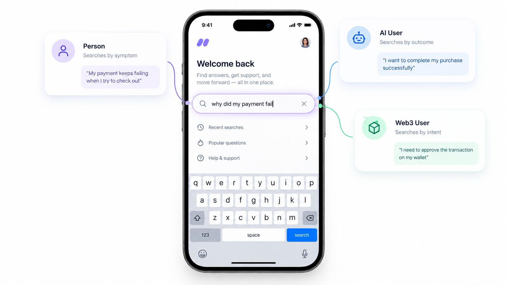
Consider a fintech app where a customer enters “money left my account but vendor says unpaid.” The product may know the records as card authorizations, settlement states, or pending transfers. Returning nothing because the customer didn't use those terms is not a ranking problem. It's a failure to help translate the customer's description into the product's vocabulary.
Help the user recover
Start with examples that show the kinds of questions the field can handle. “Find a transaction,” “search by error message,” or “ask about a setting” gives a user a useful starting point without requiring them to guess the right terminology. Keep examples relevant to the page and product, not generic phrases that could apply anywhere.
Offer suggestions that clarify scope. A query like “payment” might lead to transactions, payment settings, or help articles. Make those categories visible rather than presenting a mixed list with no explanation. If there are no matching results, say so plainly and preserve the original query. If results are uncertain or broad, say that through the interface's framing and offer a way to narrow them. Those are different situations and shouldn't look identical.
Users should be able to refine the question without starting over. Keep their words in the field, offer related terms, and let them add detail. This is a product-language problem as much as a search problem. Teams working through how content and navigation fit together can use this guide to understand information architecture, then apply that thinking to search categories and result labels.
Zero-result rate tells only part of the story. Also look at how often people reformulate, whether they reach a confident next action, and whether they complete the workflow that brought them to search. The goal isn't to make every query look clever. It's to help a person who started without the right words get somewhere useful.
Accessibility and Privacy in AI-Assisted Search
AI can make a search field feel more helpful while making it harder to understand what the product is doing. Suggestions might draw on prior searches, inferred interests, or sensitive details in a query. If the interface doesn't explain those behaviors, a “smart” field can feel unpredictable or expose context the user didn't expect to reveal.
A separate accessibility evaluation reported that none of three AI-generated websites tested was fully accessible to screen-reader users, while broader research evaluating 50 generative-AI applications found significant accessibility barriers across the set (research on accessibility in AI tools). That's a reason to test the complete search interaction, not just whether a screen reader can read the label.
Make the interaction accessible
Give the field a programmatic label that remains available after typing. Show a visible focus state, and make keyboard movement through suggestions clear. Announce when suggestions appear, which one is active, and when the list has no useful match. Don't communicate selection through color alone.
Test with screen-reader users, keyboard-only users, people with low vision, and multilingual users. A control that works for someone using a mouse and fluent product terminology may still fail for someone navigating by keyboard, listening to a screen reader, or entering a question in a different language. Accessibility should cover the suggestions and results behavior, not just the input itself. Teams can use these principles to design for accessibility as part of the product workflow.
Make data use legible
Tell users what the field remembers and whether a query is sent to an AI model. Explain why a personalized suggestion appears when that isn't obvious. Provide a way to turn personalization off and delete search history. If suggestions can expose earlier queries, give users control over whether those queries are retained or shown.
A practical privacy review should ask:
What is stored? Explain whether the product saves the current query, prior searches, or both.
What leaves the product? State whether a query is sent to an external AI service or used to personalize results.
Can the user opt out? Provide a clear non-personalized mode and a way to disable AI suggestions.
Can the user remove history? Make deletion controls easy to find and explain what they remove.
Good analytics don't require careless collection. Teams considering how to track website visitors privately can apply the same principle to search: collect what helps the product improve, and make the user's control clear.
A Founder Checklist for Shipping Search That Works
A search redesign should result in a field people can find, a query they can inspect, and a path to refine results without losing their work. Ask your design partner to walk through the full experience on desktop and mobile, including empty, active, selected, submitted, and no-result states.
Use this checklist before shipping:
Placement and width: Put search where the task happens, and make the input wide enough to keep a useful part of the query visible.
Labels and persistence: Give the field a lasting label, treat placeholder text as a hint, and preserve the query on results pages and back-navigation.
Autocomplete behavior: Verify arrow-key navigation, visible selection, Enter-to-submit behavior, and copying the selected suggestion into the input.
Query recovery: Provide relevant examples, useful scoped suggestions, clear no-result messaging, and a way to refine without starting again.
Accessibility and privacy: Test with assistive technology and make AI data use, personalization controls, and history deletion easy to understand.
Measurement: Track median and 90th-percentile query length, query reformulation, abandonment, and successful-result rate before and after changes. Use the results to decide whether users need a wider field, better language support, or different suggestions.
The right measures depend on the task, so pair them with direct research into what users were trying to do. These user research methods can help teams find where people get stuck, instead of treating a low result count as proof that search works.
Search is one of the product surfaces where design, brand, and implementation meet. 925 Studios gives AI SaaS, Web3, and fintech teams one creative partner across product design, brand design, and frontend development, so founders can ship a coherent search experience without splitting the work across three hires.
If search is hard to find, difficult to edit, or unclear about what AI remembers, 925 Studios can help your team design and build a better experience. Visit 925 Studios to discuss your product, brand, and frontend needs.

Let’s keep in touch.
Discover more about high-performance web design. Follow us on Twitter and Instagram.

