
How to Design Buttons: A SaaS & Fintech Guide

Outrank AI

A founder opens the product dashboard and knows exactly what the user should do next, but the interface doesn't make that action obvious. “Create report,” “Upgrade,” “Connect wallet,” and “Export” all compete for attention, while the most important control looks almost identical to everything around it. The product may be powerful, but the user has to stop and decode the screen before taking the next step.
That's where button design earns its place in the product. A button isn't decoration. It's the control that turns intent into an action, whether that means starting an AI workflow, confirming a payment, signing a transaction, or saving a change. This guide explains how to design buttons that are clear, accessible, technically reliable, and appropriate for dense SaaS, Web3, and fintech interfaces.
Table of Contents
Why Button Design Decides Your Conversion Rate
A user reaches the final step of a payment, sees several controls with similar weight, and pauses. The same hesitation appears when a SaaS trial offers multiple competing paths or a Web3 dashboard asks for wallet access without making the next action clear. At that moment, the button is not decoration. It determines whether intent becomes progress.
Clarity affects conversion because the button sits at the decision point. A large analysis of 18,639 landing pages found that pages with a single clear CTA converted at 13.5%, compared with 11.9% for pages with two to four CTA links and 10.5% for pages with more than five links, as reported in landing page conversion benchmarks. The practical lesson is not to reduce every screen to one control. Give each screen one action with the strongest visual and verbal weight, then make supporting actions easier to distinguish.
Treat buttons as decision points
A dashboard with five equally bright buttons makes users resolve an interface question before they can resolve the business task that brought them there. A checkout with “Continue,” “Save,” and “Confirm” in the same size creates the same uncertainty. Clear hierarchy reduces interpretation, and a readable label paired with a sufficiently large target lets users act without hunting or second-guessing.
Use three levels of action:
Primary action: Advances the main task, such as “Start free trial” or “Confirm transfer.”
Secondary action: Supports a useful alternative, such as “Save draft” or “Review details.”
Tertiary action: Handles a lower-priority option, such as “Cancel,” “Learn more,” or “View documentation.”
These styles should share a design language without sharing equal prominence. A solid fill can identify the primary button, an outline can support the secondary action, and a restrained text treatment can mark the tertiary option. Consistent wording, spacing, position, and accessible sizing should reinforce that order. Those choices support conversion together. A button that looks important but is difficult to tap still creates friction.
Why generic styles fail
Copying one button style across a marketing page, product dashboard, and payment flow creates visual consistency without functional clarity. “Connect wallet” should communicate trust and a change in account state. “Delete API key” should signal consequence. “Generate summary” should make the expected result clear before the user clicks.
CTA click-through performance varies widely. Average rates are reported around 3.4% to 4.23%, while top-performing pages can exceed 11.5%. Without a distinct source for those figures here, treat them as directional rather than as a design formula. The stronger takeaway is practical: prominence, wording, spacing, and reach all influence whether users notice and complete the intended action.
Practical rule: Make the important action easy to see, easy to understand, and easy to reach. Do not make users compare five competing buttons to find the one you wanted them to use.
The strongest button usually fits the workflow instead of demanding attention. It states the outcome, has enough space to use comfortably, responds clearly to interaction, and helps users continue with less hesitation.
Researching Context Before Drawing a Pixel
Don't start with a rounded rectangle. Start with the user's task.
A button label and visual treatment depend on what happens before and after the click. “Connect wallet” begins an identity and permission flow. “Pay securely” confirms a financial commitment. “Generate forecast” starts a process that may take time and produce a result the user needs to review. The shape can be similar, but the context changes the design decisions.
Map the action first
Write the user journey in plain language before opening Figma:
What brought the user to this screen?
What decision must they make?
What action completes the current step?
What feedback should appear immediately after the click?
What happens if the action fails, takes time, or can't be completed?
This exercise separates the primary action from nearby options. In a fintech transfer flow, “Review transfer” may be primary before the details are checked, while “Confirm transfer” becomes primary on the final step. In an AI SaaS dashboard, “Create workflow” may be primary on an empty state, but “Run workflow” becomes primary once configuration is complete.
Don't use the same label at every stage just because the underlying feature has the same name. The button should describe the user's next consequence.
Use the user's language
Product teams often write labels from an internal point of view. Users don't think “submit form.” They think “send invoice,” “save changes,” “invite teammate,” or “approve payout.” Review customer interviews, support tickets, onboarding recordings, and failed-task notes for the verbs people already use.
Support tickets are particularly useful because they reveal where the interface and the user's mental model diverge. If users repeatedly ask how to “publish” a report, a button labelled “Complete” is probably hiding the wrong concept. If they call a wallet connection “linking my account,” that wording may help explain the action, but don't replace the technical meaning if the permission is important.
Establish hierarchy before styling
List every action on the screen, then assign each one a role. If two actions appear equally important, ask whether they truly have equal business value or whether the interface is avoiding a decision.
For a subscription upgrade screen, “Choose plan” might be primary, “Compare features” secondary, and “Cancel” tertiary. For an API settings page, “Create key” may be primary, “View documentation” a navigation link, and “Revoke key” a destructive action that requires a separate visual treatment and confirmation.
The semantic distinction matters too. Use a real button for an action that changes state, opens a modal, submits a form, or triggers a process. Use a link for navigation to a destination that users may open, copy, bookmark, or share. A link can look like a button when the destination deserves more prominence, but its HTML behavior must remain a link.
Research-led button design guidance makes the same practical distinction: appearance communicates hierarchy, while code communicates behavior. Decide both before implementation.
Visual Hierarchy and Interaction States
A button isn't a static object with one appearance. It communicates whether it can be used, whether the pointer is over it, whether it has been pressed, and whether the system has temporarily removed its availability.
Compare strong and weak treatments
In a dark-mode fintech interface, a bright purple “Confirm transfer” button on a near-black surface can establish a clear primary action. A muted outline “Back” control can remain available without competing. A red “Delete beneficiary” control should communicate danger through more than hue, especially if the interface also supports users with color-vision differences.
A weak version gives every action the same saturated fill. Another uses a faint gray secondary button that looks disabled. A third relies on a shadow to signal clickability, even though the shadow disappears against a dark background or on a low-quality display.
Use shape, placement, text weight, and contrast together. Color can reinforce hierarchy, but it shouldn't be the only evidence that two controls have different roles.
Design all four states
The default state should make the control's availability and purpose obvious. The hover state can use a subtle color shift, border change, or lift effect, but it shouldn't transform the button so dramatically that the label moves or the layout jumps.
The active state needs to show that the interface received the input. A small change in fill, position, or elevation is enough. On touch devices, there may be no hover state, so the pressed state and immediate feedback matter more.
The disabled state should explain that the action is unavailable without making the control impossible to understand. Don't use disabled styling to hide an error. If a user must complete a missing field before proceeding, explain that requirement near the button or the relevant field.
A product team can document these states in a visual hierarchy reference such as this guide to visual hierarchy, then apply the same logic to buttons across the product.
Write labels around outcomes
“Submit” describes a technical event. “Send invoice” describes what the user is trying to accomplish. “Click here” describes nothing useful. “Continue” may be acceptable in a simple, linear flow, but it becomes weak when a user needs to understand the consequence of the next step.
Prefer labels such as:
Start free trial: The user knows an evaluation begins.
Connect wallet: The user understands an account connection is involved.
Review transfer: The user knows they aren't authorizing payment yet.
Pay securely: The user understands the next action has a financial consequence.
Save as draft: The user knows the work won't be published.
Keep labels short, but don't remove the words that establish trust. In a checkout, “Pay securely” is more informative than “Continue.” In an AI workflow builder, “Run forecast” is clearer than “Go.”
Accessibility Standards and Touch Targets
Accessible buttons reduce friction for users with visual, motor, and cognitive impairments, but the same design decisions also help people using a phone one-handed, working in bright light, or navigating a crowded dashboard.
Use contrast for both text and shape
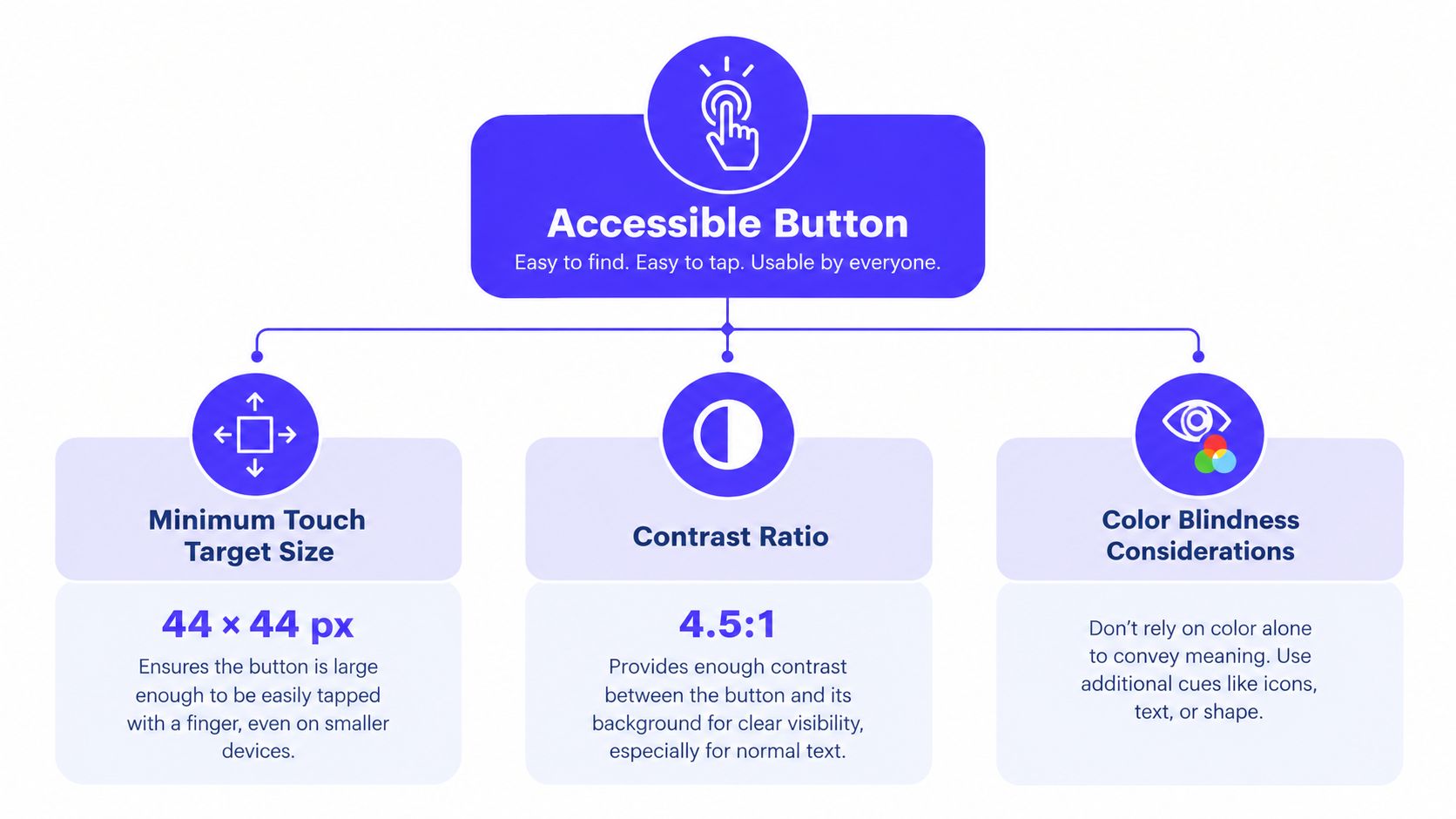
Button text should maintain at least a 4.5:1 contrast ratio against its background. The button boundary or shape should maintain at least 3:1 contrast against the surrounding page, as set out in button accessibility tests from the U.S. Web Design System.
These are two different checks. White text may be readable on a dark purple fill while the purple button itself blends into a dark page. An outlined secondary button may have readable text but an almost invisible border. In both cases, the user can struggle to identify the control.
Contrast ratios compare the relative luminance of foreground and background colors. You don't need to calculate them by hand. Use a contrast checker in your design tool, then verify the rendered component in light mode, dark mode, disabled states, and error states.
Don't rely on color alone. A destructive action can use a warning color, but its label, location, icon, and confirmation step should also communicate risk. A selected state can use a fill change plus a border, checkmark, or text treatment.
For teams building a broader accessibility process, compliance and KPIs for accessibility can help connect interface checks with operational measurement. The button itself still needs to pass the practical test: can a user identify it, understand it, focus it, and activate it?
Make the hit area larger than the label
WCAG 2.2 target-size guidance is commonly summarized as a minimum of 24 × 24 CSS pixels, with exceptions for some inline controls and cases where a larger equivalent is available, as described in target-size guidance for button accessibility. That minimum isn't always a comfortable mobile target.
Accessibility and mobile usability guidance commonly uses 44 × 44 pixels as a touch target baseline, while platform conventions often use 48 × 48 points or density-independent pixels. Independent benchmark summaries report that a 48 × 48 pixel touch target can double mobile conversions, and that larger CTA buttons can raise click-through rates by about 90%, as summarized by CTA and touch-target benchmarks. Treat those performance claims as directional evidence, not a reason to make every button enormous.
A compact icon button can keep a small visible icon while receiving a generous invisible hit area. Add space between adjacent controls so “Delete” and “Edit” can't be triggered accidentally. In a dense trading or admin interface, preserve the visual density in the layout, but give the interactive area enough room to be used comfortably.
Keep semantics aligned with appearance
Use <button> for actions and <a> for destinations. A link styled as a button may look correct, but it retains link behavior for keyboard users, screen readers, browser menus, and navigation patterns. A native button also gives your team a reliable starting point for focus behavior and form interaction.
More practical guidance on applying these principles is available in designing for accessibility. The important point is that accessibility isn't a separate pass after conversion design. A clear label, adequate target, visible focus state, and correct element all reduce uncertainty at the moment of action.
Building Tokens for Implementation
A button system fails when the design exists only as a Figma component. Developers need named decisions they can reuse without opening a design file for every new screen.
Start by defining the properties that must remain consistent:
Size: Set height, horizontal padding, icon spacing, and text style for each supported button size.
Color: Define background, text, border, hover, active, focus, and disabled values as semantic tokens rather than raw color names.
Shape: Choose a radius that fits the brand and keep it consistent across actions with the same role.
Spacing: Define the gap between an icon and label, the spacing between adjacent buttons, and the padding around button groups.
State: Document what changes on hover, focus, active, loading, success, error, and disabled states.
A semantic token such as button-primary-background tells a developer why a value exists. A token such as purple-500 only tells them where the color came from. If the brand palette changes, semantic tokens let the team update the system without hunting through every component.
Connect design tokens to CSS
A practical implementation can use CSS custom properties such as --button-primary-bg, --button-primary-text, and --button-focus-ring. The component then references those variables for each state instead of embedding one-off values in individual screens.
The same source should map to your framework's component props or utility classes. A developer should be able to write a primary button with a loading state without rebuilding its padding, radius, focus ring, and disabled treatment. If a button needs a special exception, document why it exists rather than silently creating a new variant.
The focus state deserves a named token and a visible treatment. Don't remove the browser outline unless you replace it with something equally clear. Keyboard users need to see where they are, especially in a dashboard with forms, tables, and modal dialogs.
Build a contract between design and code
For each variant, document:
When to use it.
When not to use it.
Which HTML element it requires.
Which states it supports.
What content length it can handle.
How it behaves while loading or failing.
How it works in light and dark themes.
A design system component workflow helps teams keep those rules visible rather than burying them in disconnected mockups. The goal is not to create endless variants. It's to give developers a small, dependable set of choices that prevents accidental inconsistency.
For AI SaaS and fintech products, align the marketing site and application interface where it makes sense. A visitor shouldn't learn one visual language on the pricing page and encounter an unrelated one after signup. The product can become denser, but the relationship between primary, secondary, and destructive actions should remain recognizable.
Testing and Integrating into Your System
A button is finished when it works in the shipped product, not when its component looks polished in a design file. Test the visual treatment, the interaction, the semantics, and the business outcome together.
Test the rendered control
Start with automated checks for contrast, focus visibility, accessible names, and target dimensions. Run them against the actual component in every theme and state. A passing default state doesn't guarantee that hover, disabled, loading, or error states remain readable.
Then test manually with a keyboard. Use Tab to reach the control, confirm the focus indicator is visible, activate it with the expected keyboard input, and check that focus moves sensibly when a dialog opens or closes. A screen reader test should announce the control's name and role accurately. “Button, Submit” may be technically announced correctly, but “Button, Send invoice” gives the user far better information.
On mobile, test with one hand and with the device held in the way your users work. Check buttons near screen edges, adjacent actions, sticky bottom CTAs, and icon-only controls. A visually neat layout can still produce accidental taps when the hit areas overlap.
Test decisions, not just clicks
Track whether users complete the intended task after interacting with the button. Useful product signals include click-through rate, completion rate, time to completion, validation errors, repeated taps, cancellation, and support requests about the flow.
Don't interpret a higher click rate as success by itself. A misleading “Continue” button can earn clicks while increasing failed payments or abandoned forms. For a wallet connection, measure whether users complete the connection and understand the permissions. For an AI feature, check whether users run the workflow and receive a useful result, not merely whether they press “Generate.”
A button metric needs a task metric beside it. More clicks are valuable only when they represent clearer progress.
Add rules to the system
Document button usage next to related components such as forms, dialogs, tables, navigation, and notifications. Show a real example for a primary action with a secondary alternative. Show a destructive action with its confirmation behavior. Explain when a text link is appropriate and when a navigation link should receive button-like visual prominence.
A repeatable release checklist can stay short:
Is the label specific about the outcome?
Is there one clear primary action?
Is the element semantically correct?
Are default, hover, active, focus, loading, and disabled states designed?
Does text meet the 4.5:1 contrast requirement and the button boundary meet 3:1, based on the accessible button contrast guidance?
Is the touch area practical on mobile?
Can keyboard and screen-reader users complete the task?
Do analytics measure successful completion, not only clicks?
Are the tokens and usage rules available to the implementation team?
925 studios helps AI SaaS, Web3, and fintech companies turn product decisions into brand systems, interfaces, and shipped frontend work. If your buttons, dashboard flows, or design tokens need a senior product design and build partner, visit 925 studios to discuss the interface you need to ship.


Let’s keep in touch.
Discover more about high-performance web design. Follow us on Twitter and Instagram.

