
8 Design Process Steps for Startup Teams

Yusuf
Founder and lead designer at 925studios

Five design process steps form the canonical human-centered model, while startup teams often need eight operating stages that carry work from evidence to implementation, launch, and iteration. The strongest design process steps move from user insight to product structure, tested interfaces, shipped code, and measured improvement, instead of jumping straight into polished screens.
Good design starts before the first screen. Startup teams often open Figma before agreeing on the user problem, the product priority, or the evidence that would prove the work succeeded. That creates attractive interfaces around weak assumptions, then forces expensive changes when users, engineers, or investors expose the gaps.
The modern process has roots in the five-stage model of Empathize, Define, Ideate, Prototype, and Test, described in Stanford-derived materials and government training slides as a repeatable path from user insight to decisions. Mature organizations have formalized this kind of workflow at scale, with 78% of design-led companies reporting a defined process for generating new digital customer experience ideas in the cited government training slides.
For an AI SaaS, Web3, or fintech startup, each stage needs a decision, a concrete deliverable, clear ownership, and an outcome measure. You can scale the depth to match risk, budget, and team size, but skipping the thinking rarely saves time. This guide covers the eight stages that connect discovery, strategy, product design, brand, frontend implementation, validation, scalability, and launch. When a team doesn't want three separate hires, 925 Studios combines product design, brand design, and frontend implementation in one creative partnership.
Table of Contents
1. Discovery and Research
Discovery decides whether the team is solving a real problem before design work makes assumptions expensive. Before building a dashboard, onboarding flow, wallet, or marketing site, identify what users are trying to accomplish, where they get blocked, and which constraints shape a viable product.
Start with a question the team can answer. Review existing research and support conversations, define the people included and excluded, choose methods, secure informed consent, conduct interviews or observations, organize the material, identify themes, and document the reasoning. A practical design research process provides a useful sequence for keeping discovery focused rather than turning it into a collection of opinions. Teams can also use this guide to compare user research methods before selecting an approach.
Decide what deserves investigation
The first decision is which user problem deserves attention, for whom, and under what conditions. A fintech team may find that onboarding abandonment comes from unclear document requirements, not difficult form mechanics. An AI SaaS team may discover that customers use the product for a workflow absent from the roadmap, creating a stronger opportunity than the founders' original idea. A Web3 team may learn that wallet recovery and transaction explanation matter more than another trading feature.
The core deliverable is a research brief with:
Research questions: State what the team needs to learn and which assumptions remain untested.
User evidence: Record behaviors, workarounds, objections, and exact language instead of polished summaries alone.
Constraint map: Include budget, timeline, technical dependencies, compliance requirements, and security concerns.
Opportunity themes: Distinguish repeated problems from isolated requests and loud stakeholder opinions.
A qualitative study can begin with a small group of users. Nielsen Norman Group notes that testing with 5 users can reveal nearly as many usability problems as much larger studies according to Nielsen Norman Group. Treat that figure as a starting point, not a fixed rule. Recruit people who resemble the target audience, ask open questions, observe competing products, and involve the technical lead before conclusions harden.
Responsible roles: The founder or product lead owns problem framing. A designer or researcher leads sessions and synthesis. Engineering, compliance, and customer-facing teammates surface delivery constraints and recurring support issues.
Timeline guidance: Match research depth to risk. A narrow improvement may need a focused sprint. A new regulated product needs broader investigation before interface exploration.
Tools: Use consented recordings, interview notes, a research repository, competitor audits, journey maps, and a shared decision log.
Outcome metrics: The team should state the target user, core task, primary pain point, and success condition without disagreement.
Failure signals: Stakeholders describe users through assumptions, research includes only internal interviews, or every conversation expands the roadmap without changing a clear priority.
2. Strategy and Information Architecture
Research becomes useful when it changes what the team builds. Strategy and information architecture turn scattered findings into a product direction, a prioritized scope, and an understandable structure for screens, content, permissions, and workflows.
The main decision is what not to build yet. An AI SaaS product may have powerful automation, integrations, reporting, and collaboration features, but a first release might need to make one core workflow obvious. A Web3 platform may need separate paths for retail investors, developers, and institutional users rather than forcing everyone through one generic experience. A fintech product needs to show where trust, verification, approval, and transaction states belong before anyone decorates the interface.
Make the product legible
The deliverable is an information architecture and product strategy that people can inspect. It may include a value proposition, prioritized feature list, user journeys, navigation model, workflow diagrams, and phase-specific success criteria.
Map each important journey visually. Show entry points, decisions, errors, permissions, empty states, and completion states. A dashboard that looks simple in a sitemap can become confusing once a user must compare accounts, export data, invite teammates, or recover from a failed action.
Practical rule: If the technical lead can't explain how the proposed structure will be built and maintained, the architecture isn't ready for visual design.
Test the structure before investing in high-fidelity UI. Ask representative users to find a report, start an action, locate a setting, or explain what a section contains. Their confusion can expose naming and hierarchy problems while changes are still cheap.
Responsible roles: The founder or product leader sets business priorities. Product design owns journeys and architecture. Engineering estimates complexity and dependencies. Legal, risk, or compliance partners review constraints in fintech and Web3 products.
Timeline guidance: Finish enough structure to support the next design decision, not a theoretical map of every future feature. Revisit it when research, technical discovery, or product strategy changes.
Tools: Use flow diagrams, card sorting, tree testing, a product brief, and a prioritization board. Figma, FigJam, Notion, and Linear can work together if the team maintains one source of truth.
Outcome metrics: Measure whether users can identify the next step, find key destinations, and complete the intended journey without unnecessary detours. Business outcomes may include activation, qualified conversion, retained usage, or successful task completion.
Failure signals: The navigation mirrors internal departments, every feature receives equal priority, or designers produce screens before the team agrees on the primary journey.
3. Design Exploration and Prototyping
A prototype should settle product decisions before code makes them expensive to change. Use it to test the architecture, hierarchy, language, and interaction logic, then discard weak directions before frontend work begins.
Start with distinct product concepts, not minor changes to color or spacing. An AI SaaS team could compare a task-first dashboard, an assistant-led workspace, and a report-first layout. A fintech team might test whether security explanations belong inline, in a review step, or inside guided setup. A Web3 team could compare a transaction flow that explains network fees early with one that introduces them at confirmation.
Prototype the risky parts
The deliverable is a set of low-fidelity wireframes or flows for broad exploration, followed by higher-fidelity prototypes for paths carrying product or business risk. Focus on workflows where users may misunderstand a permission, hesitate before a transaction, or miss the next action. Polishing every screen spreads effort without improving the decision.
Use moderated sessions to learn why people struggle, and quantitative research when the team needs to measure the size of a known problem. Ask representative users to complete realistic tasks, then record task success, hesitation, comprehension, and confidence. The sample size should match the question and the decision at hand, rather than follow a fixed rule.
Place an early visual reference near the start of the work:
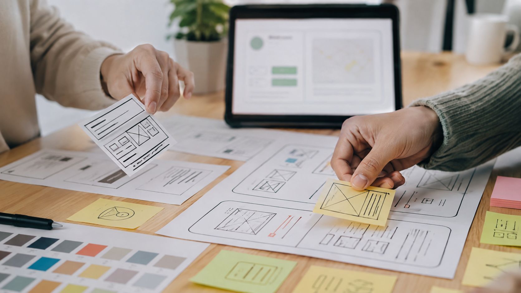
Ask users to think aloud, stay quiet during hesitation, and avoid defending the design. The goal is to expose their mental model, not secure approval for the team's effort. Build a component library alongside the prototype, while keeping untested interactions flexible.
A later walkthrough can show stakeholders the intended behavior:
Decision: Choose the direction that resolves the highest-risk user and business questions with the least implementation uncertainty.
Responsible roles: Product design leads exploration and sessions. Product leadership selects the direction to advance. Engineering checks feasibility and dependencies. Brand or marketing joins when the prototype affects positioning or conversion.
Timeline guidance: Explore broadly at the start, then narrow around evidence. Use high-fidelity work for flows the team will test, sell, or use to align implementation.
Tools: Figma, FigJam, Maze, moderated calls, consented screen recordings, and a shared issue log support this stage.
Outcome metrics: Track task success, time to understand the next action, hesitation, confidence, and problem severity. A clear decision and tested prototype are stronger outputs than stakeholder preference.
Failure signals: The team tests only polished screens, asks leading questions, or collects opinions without an agreed decision rule.
4. Visual Design and Brand Application
Visual design should make a validated product easier to understand and easier to trust. It isn't a decorative layer applied after the core work. Typography, color, spacing, imagery, iconography, and motion influence whether a fintech product feels reliable, whether a Web3 product feels accessible, and whether an AI SaaS product communicates capability without becoming intimidating.
The decision is how the brand behaves in real product situations. A logo and a homepage aren't enough. The team needs to define how the brand handles a warning, a failed transaction, an empty dashboard, a pricing comparison, a loading state, and a high-value conversion moment.
Connect brand promise to interface behavior
The deliverable is a visual system that works across the product, marketing site, and sales materials. Use a consistent type hierarchy, meaningful color roles, reusable components, icon rules, imagery direction, and motion principles. A technical Web3 company might choose a precise visual language with welcoming explanations instead of copying either corporate finance or playful crypto aesthetics.
Accessibility belongs in the visual system from the beginning. Government of Canada accessibility guidance requires clear keyboard focus states, required color contrast for text and interface components, and accessible form labels with clear instructions in its design system guidance. These are implementation requirements, not optional polish.
A practical brand system should help a developer make the right choice without asking the designer to approve every button. Document usage, exceptions, responsive behavior, and content examples. For a conversion-focused marketing site, the same discipline supports a converting homepage for agencies, where hierarchy should guide a visitor toward understanding and action rather than displaying every message at once.
Responsible roles: Brand design sets the visual language. Product design applies it to interaction states. Marketing protects positioning and message hierarchy. Frontend development confirms that the system can be implemented consistently.
Timeline guidance: Establish the core visual direction before expanding into every page. Validate the highest-risk product states before completing a large asset library.
Tools: Figma libraries, design tokens, accessibility checkers, content inventories, and a shared brand guideline work well together.
Outcome metrics: Assess comprehension, trust, brand recognition, accessibility conformance, and consistency across product and marketing touchpoints.
Failure signals: The product and website look unrelated, color communicates different meanings in different areas, or the team uses visual trends without a clear brand reason.

5. Front-End Development and Implementation
A design file isn't the product. Frontend implementation turns the approved direction into HTML, CSS, JavaScript, responsive layouts, states, transitions, and accessible interactions that users can operate on real devices.
The central decision is what must be preserved from the design and what should change for technical, performance, or accessibility reasons. A desktop composition may need a different hierarchy on mobile. An animation may create latency or distract from a critical action. A component may look elegant in Figma but need a simpler implementation to remain reliable across browsers.
Treat handoff as collaboration
The deliverable is production-ready code connected to a maintainable component structure, not a static screenshot. Designers and developers should review responsive behavior, loading states, errors, focus states, empty states, content length, and localization assumptions together.
Build from small screens outward, test on real devices and browsers, and check accessibility during implementation. The UK government states that WCAG 2.2 AA is the minimum accessibility standard for UK public sector websites and mobile apps, including services using third-party tools, with compliance monitoring starting from October 2024 in its accessibility guidance. Even startups outside the UK can use this as a clear quality baseline for public-facing work.
Use a repeatable handoff process rather than sending one large design file over the wall. The Figma to live website workflow is relevant when the same partner needs to connect design intent with a working interface.
Responsible roles: Frontend developers own implementation quality. Designers clarify intent and review the build. Product leaders resolve scope trade-offs. QA and accessibility specialists verify behavior where the risk justifies dedicated review.
Timeline guidance: Build the riskiest responsive and interactive components early. Leave room for browser testing and design review before calling a feature complete.
Tools: Use the chosen component framework, Figma, Storybook or an equivalent component reference, browser testing tools, Lighthouse, and Core Web Vitals monitoring.
Outcome metrics: Track task completion in production, accessibility issues, performance health, error rates, and visual consistency across supported environments.
Failure signals: Handoff happens once, mobile is treated as a later adaptation, or the team measures success only by visual similarity to the design file.
6. Testing and Validation
Testing asks whether the shipped or proposed experience solves the problem the team defined. It combines qualitative evidence about why users behave a certain way with quantitative evidence about what happens at scale.
A Web3 wallet may look obvious to its internal team while confusing first-time users with technical language. A pricing page may receive traffic but fail to communicate which plan fits a buyer. An AI product may have strong capabilities that users never discover because onboarding explains features instead of showing the value of the first successful task.
Measure before changing
Set up analytics before launch so the team has a baseline. Define success around outcomes such as activation, retention, qualified conversion, successful setup, or completed workflows, not pageviews alone. For product UX benchmarks, Nielsen Norman Group recommends defining exact tasks and success metrics, establishing a baseline before redesign, then repeating the methodology after shipping to compare performance and calculate ROI using its product UX benchmark approach.
Use moderated usability sessions to learn where people hesitate. Use session recordings, support conversations, surveys, funnel analysis, and controlled experiments to understand patterns. A/B testing can help when the traffic and decision are appropriate, but it shouldn't turn random preference into false certainty.
Test the behavior you need, not the opinion you want.
Responsible roles: Product owns the measurement plan. Design leads usability evaluation. Engineering implements analytics and experiments. Marketing, support, and compliance add context that product data may miss.
Timeline guidance: Validate before launch for high-risk flows, then continue after release. Fix severe comprehension, trust, accessibility, and payment problems before polishing low-impact details.
Tools: Product analytics, event schemas, session recordings, moderated interviews, accessibility testing, experiment platforms, and an issue-priority matrix.
Outcome metrics: Track task success, activation, retention, conversion, error recovery, support volume, and user confidence. Pair each important number with qualitative evidence explaining the cause.
Failure signals: Events aren't defined consistently, the team celebrates traffic without measuring completion, or every test runs until leadership sees a preferred result.
For a practical introduction to moderated research, check out this SubmitMySaas usability testing guide. The method matters less than matching the study to the decision and acting on what users reveal.
7. Design Systems and Scalability
A design system turns repeated decisions into shared infrastructure. It includes component documentation, usage guidance, code implementations, design tokens, accessibility rules, and examples that help a team create new screens without rebuilding the same choices from scratch.
Don't begin by designing every possible component. Start with the patterns that appear in the actual product, such as buttons, forms, tables, navigation, alerts, authentication states, and transaction summaries. An AI SaaS team may need a lightweight system for its real workflow, while a growing fintech platform may need stronger governance around data tables, status colors, permissions, and error handling.
Build for adoption, not admiration
The deliverable is a maintained connection between design and code. Designers should use shared libraries. Developers should consume the corresponding components. Product leaders should understand which decisions are stable, which are experimental, and which require review.
Document why a component exists, not only how it looks. Include keyboard behavior, focus states, contrast expectations, content rules, responsive behavior, and misuse examples. Version the system, communicate changes, audit real usage, and retire components that create confusion.
Management buy-in is a measurable constraint. The 2026 Design Systems Report found that 32% of respondents were satisfied with their ability to get management buy-in, down from 42% in 2025, while 40% were dissatisfied in the report. That gap makes the business case important. Connect the system to reduced duplication, accessibility compliance, consistency, and development capacity rather than presenting it as a visual library for designers.
Responsible roles: Design and frontend jointly maintain the system. Product leadership protects adoption. Accessibility, brand, and engineering representatives review changes that affect quality or risk.
Timeline guidance: Introduce the system while building real work, then formalize the highest-use patterns. Avoid pausing product delivery for a large theoretical rebuild.
Tools: Figma libraries, component repositories, Storybook, token management, documentation, issue tracking, and release notes.
Outcome metrics: Measure reuse, implementation consistency, accessibility coverage, time spent resolving repeated UI decisions, and the number of product surfaces using approved patterns.
Failure signals: The library contains components nobody uses, design and code versions diverge, or teams bypass the system because documentation doesn't explain practical usage.
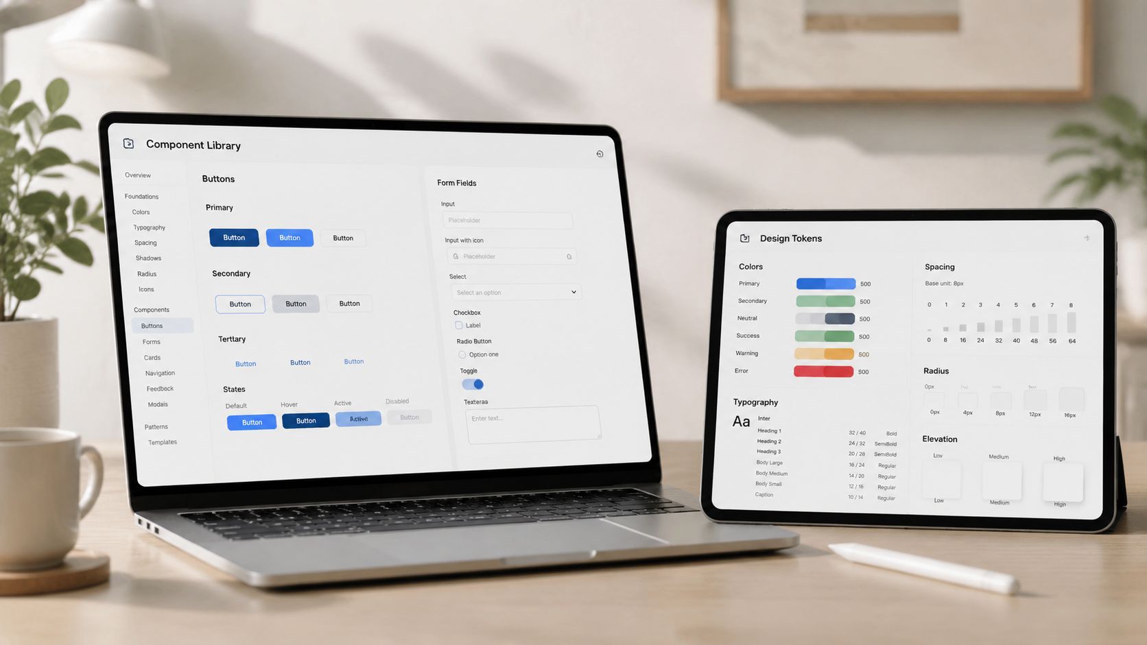
For teams building from real product work, design system components should serve as shared working material, not a separate design exercise.
8. Launch and Iteration
Launch is the point where controlled assumptions meet real usage. It isn't the end of the design process. It starts the next evidence cycle, because production users bring different devices, expectations, workflows, accessibility needs, and levels of trust than participants in a planned study.
The decision is what to monitor, what threshold triggers action, and how the team will prioritize changes. A Web3 product may need close observation of failed confirmations and support questions. An AI SaaS product may need to learn whether users reach its primary feature after onboarding. A fintech product may need to watch both successful task completion and signals of hesitation around verification or payment.
Ship small enough to learn
The deliverable is a launch plan connected to instrumentation, support readiness, feedback channels, and an iteration backlog. Use in-app surveys, email, support conversations, sales calls, session recordings, and product analytics together. No single channel explains the whole experience.
Keep the first release focused on the core problem. That doesn't mean shipping carelessly. It means protecting the essential workflow while deferring ideas that add surface area without improving the user's main outcome.
Responsible roles: Product owns launch decisions and prioritization. Engineering monitors reliability. Design interprets behavior and proposes improvements. Support, sales, and marketing return customer evidence to the team.
Timeline guidance: Release in small batches when possible, especially for conversion-critical or regulated workflows. Give each meaningful change enough observation time to distinguish a real effect from noise.
Tools: Monitoring and alerts, product analytics, feature flags, feedback tools, support systems, and a decision log that records what changed and why.
Outcome metrics: Track the core user and business outcomes defined earlier, along with errors, support volume, retention, and accessibility issues. Compare results with the baseline rather than relying on launch-day excitement.
Failure signals: Nobody owns post-launch learning, feedback stays in separate departments, or the team keeps adding features while the primary workflow remains difficult.
The strongest teams repeat discovery, architecture, prototyping, testing, and evaluation as new evidence appears. Recent user-centered guidance from Figma makes the same practical point, user-centered questions belong at every stage, not only during research in its resource on user-centered design questions. For AI SaaS, Web3, and fintech products, that iterative model is safer than treating one successful prototype test as final approval.
8-Step Design Process Comparison
Phase | Implementation complexity | Resource requirements | Expected outcomes | Ideal use cases | Key advantages |
|---|---|---|---|---|---|
Discovery and Research | Medium, structured user & market investigation | Researchers, stakeholder time, user interviews, analysis tools | Validated problem statement, user insights, constraints | Early-stage ideas, product-market fit checks | Prevents building unwanted features; uncovers real pain points |
Strategy and Information Architecture | Medium, requires cross-functional alignment and mapping | Product leads, designers, technical input, journey mapping tools | Prioritized roadmap, IA, user journeys, success metrics | Complex products, multi-audience flows, pre-design planning | Provides a clear blueprint; reduces scope creep |
Design Exploration and Prototyping | Medium–High, multiple design directions and testing | Designers, prototyping tools, test users, iteration time | Wireframes, interactive prototypes, tested design direction | Validating UX, investor demos, choosing interaction patterns | Reveals usability issues early; avoids costly rework |
Visual Design and Brand Application | Medium, visual system creation and accessibility checks | Brand/designer resources, design tooling, accessibility testing | Visual system, component styles, brand guidelines | Launching brand-consistent UI, marketing/product cohesion | Builds trust and recognition; improves perceived quality |
Front-End Development and Implementation | High, code, compatibility, performance and integration | Front-end devs, QA, device/browser testing, frameworks | Production-ready UI, responsive implementation, component code | Converting designs into live product, MVP builds | Delivers interactive product; ensures performance and accessibility |
Testing and Validation | Medium, requires statistical rigor and tooling | Analytics, testing platform, user testers, analysts | Usability findings, A/B results, behavior metrics | Pre-launch validation, conversion optimization, post-launch QA | Data-driven improvements; catches real-world usability problems |
Design Systems and Scalability | High initially, lower ongoing, documentation and governance | Designers + devs, documentation tools, versioning, maintenance time | Component library, design tokens, implementation guides | Scaling teams, multiple products, long-term consistency | Speeds feature delivery; ensures consistent UX and onboarding |
Launch and Iteration | Medium, monitoring, feedback loops, rapid updates | Ops, support, analytics, product managers, dev capacity | Live metrics, user feedback, prioritized improvements | Post-MVP growth, continuous improvement, market learning | Real-world validation; enables rapid, data-led refinement |
Turn the Process Into a Repeatable Advantage
The eight design process steps work as a loop, not a one-time checklist. Discovery changes strategy. Strategy shapes architecture. Prototypes expose weak assumptions. Visual design makes the experience recognizable and trustworthy. Frontend implementation reveals technical and responsive realities. Testing compares behavior with intent. Design systems preserve what works. Launch creates the evidence for the next cycle.
Founders don't need to complete every activity at maximum depth. A small landing-page test and a regulated payments workflow have different research, accessibility, compliance, and validation needs. The operating principle stays consistent, define the decision, create the smallest useful deliverable, test it with the right people, and measure the outcome that matters.
Choose the next stage where evidence, clarity, or implementation is weakest. If customer understanding is uncertain, write one research question and schedule interviews. If the product feels crowded, map the primary journey and remove features that don't support it. If the design looks strong but the build feels fragile, pair a designer and frontend developer around responsive states, performance, accessibility, and reusable components.
Each stage should leave behind something another person can use. A research repository should help product make a decision. An architecture map should help design and engineering align. A prototype should expose a risk. A visual system should guide implementation. A measurement plan should tell the team whether a change helped or hurt.
This discipline also protects the founder's attention. Instead of debating whether a screen feels polished, the team can ask whether users understand the action, complete the task, trust the outcome, and return to the product. That shift connects design work to product, brand, and commercial decisions without reducing design to a spreadsheet.
925 Studios is structured for teams that need those connections without building a large in-house department. As one creative partner, it covers strategy, UI and UX, brand identity, website design and development, design systems, and frontend implementation for AI SaaS, Web3, and fintech companies. The benefit isn't just having more design output. It's keeping the reasoning, visual language, product decisions, and shipped pixels connected from the first brief through the next iteration.
Start with one stage, one deliverable, and one outcome measure. Then schedule the smallest validation cycle that can change your mind. A repeatable process becomes an advantage when your team uses evidence to decide what deserves the next investment.
925 Studios helps AI SaaS, Web3, and fintech teams connect product design, brand design, design systems, and frontend development through one creative partner. If your next release needs clearer strategy, stronger interface decisions, or production-ready implementation, visit 925 studios and start a conversation about the work.


Let’s keep in touch.
Discover more about high-performance web design. Follow us on Twitter and Instagram.

