
Conversion Focused Website Design for Startups

Outrank AI

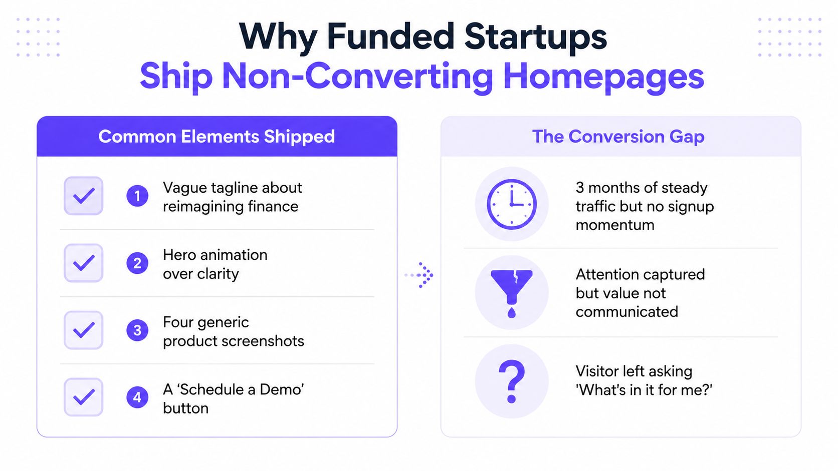
A founder launches a polished homepage for a funded AI SaaS product. The hero animation looks expensive, the product screenshots are carefully staged, and the primary button says “Schedule a Demo.” Three months later, traffic is steady, but signups are flat. The site creates attention without creating enough confidence or momentum to earn the next action.
That pattern appears across AI SaaS, Web3, and fintech. Funding can pay for visual polish, but it doesn't automatically produce clear positioning, persuasive sequencing, or a low-friction path to conversion. Conversion-focused website design is a sequencing problem, where research, architecture, copy, hierarchy, trust, speed, and testing need to arrive in the right order.
Table of Contents
Why Most Funded Startups Ship Something That Does Not Convert
Information Architecture and Page Flow That Earns the Scroll
Why Most Funded Startups Ship Something That Does Not Convert
The usual failure starts before the design file opens. A team jumps into visual direction because visual work feels tangible. Someone chooses a dark interface, a cinematic animation, or a gallery of dashboard screens, then the team tries to fit the product story around those decisions.
That approach creates a brand showcase instead of a sales conversation. A homepage should help a skeptical visitor answer a small set of questions quickly: Is this for a company like mine? Does it solve a problem I recognize? Can I trust it? What should I do next?
The benchmark gap makes this worth fixing. The average website conversion rate across industries is 2.35%, while top-performing sites reach about 5.31% or higher, according to conversion-focused web design benchmarks. The exact result will vary by product, traffic source, device, and intent, but the principle is consistent. The same visitors can produce very different business outcomes when a page communicates value clearly and removes hesitation.
Start with evidence, not pixels
Before opening Figma, I use three inexpensive research inputs.
Study category expectations: Pull the top 10 organic competitors for the category. Screenshot their homepages, pricing pages, and testimonials. Tag the problems they lead with, the audience they name, and the CTAs that repeat. This doesn't mean copying them. It shows what a buyer already expects to find.
Use customer language: Record five customer calls and extract the exact phrases buyers use to describe the problem. A fintech operator may say, “I can't explain unexplained variances during close.” That language is more useful than an internal phrase such as “next-generation financial intelligence.”
Mine search intent: Review the “People Also Ask” box and relevant Reddit threads for the core query. Note the questions, objections, and comparisons that appear repeatedly. Those questions belong in the page architecture, not in a private sales enablement document.
Put the findings into a one-page positioning brief. It should name the target buyer, the job to be done, three proof points, the primary action, and the objection the page must disarm.
Sequence the decision
A homepage for an unfamiliar technical product needs one job per screen. The hero establishes relevance. The next section makes the value concrete. Later sections answer trust, implementation, security, pricing, and risk questions.
A fintech product that leads with “reimagining finance” forces the buyer to translate the promise. A stronger page might lead with automated reconciliation for a specific finance team, then show how exceptions are detected, how data is handled, and what happens after a demo.
Teams that want a broader strategic reference can review the Come Together Media LLC expert strategy, especially when they need to connect research, messaging, and page decisions instead of treating CRO as a button exercise.
Information Architecture and Page Flow That Earns the Scroll
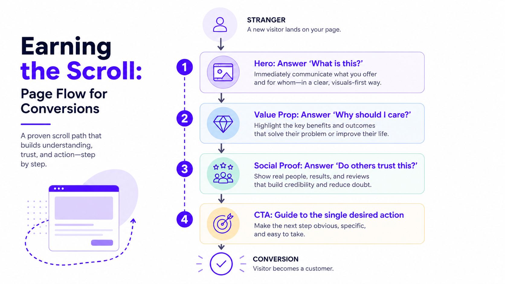
Information architecture is the order in which a stranger meets your argument. On a conversion-focused site, each section should answer one question and create the reason to ask the next.
A practical flow for AI SaaS, Web3, and fintech looks like this:
Hero: State the outcome, identify the buyer, and offer one primary CTA.
Proof bar: Show named customers, partners, or credible validation.
Problem framing: Describe the operational pain in the buyer's language.
Product demonstration: Connect the interface to that pain, not to a feature inventory.
Mechanism: Explain how the product works without requiring technical translation.
Risk and implementation proof: Address security, integrations, compliance, or support.
Customer evidence: Use a named story with a concrete result when verified data is available.
Qualification or pricing: Help the right buyer understand the commercial next step.
FAQ and final CTA: Resolve remaining objections, then repeat the desired action.
The order changes by category. Fintech visitors may need SOC 2, regulatory, or fee information before they'll consider pricing. AI buyers may need to understand model behavior, data handling, and human review before they request a demo. Web3 buyers may look for wallet compatibility and chain support early.
Practical rule: If a section doesn't answer a buyer question, strengthen the next decision, or reduce a known objection, remove it.
Use this information architecture guide to map the page before styling it. A flow diagram exposes weak sequencing quickly. If security proof appears after three unrelated feature sections, or the CTA asks for a demo before the visitor understands the product, the problem isn't visual polish. The page is asking for trust before earning it.
Headline and Copy Strategy That Speaks to Skeptical Buyers
A polished sentence rarely moves a technical buyer by itself. Buyers who evaluate AI infrastructure, financial workflows, or Web3 products want to know what changes in their work, for whom, and with what risk.
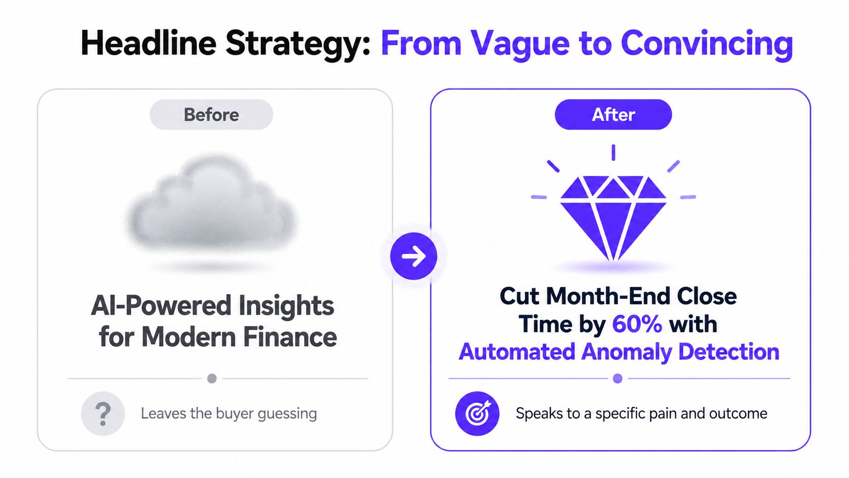
Compare a vague statement such as “AI-powered insights for modern finance” with a specific promise that names a user, an action, and an outcome. A reconciliation product might say, “Find unexplained ledger variances before close.” An AI SDR product might say, “Turn qualified account signals into researched outbound drafts.”
The second versions give the reader something to verify. They also give the rest of the page a job. The product demonstration can show variance detection, while the proof section can explain the data sources and review process.
Build a promise stack
The headline should make the core promise. The subhead should add audience, mechanism, or context. The proof blurb should make the claim credible. The CTA should describe the next step rather than repeat a slogan.
For example:
Headline: Find unexplained ledger variances before close.
Subhead: Automated reconciliation for finance teams that need traceable exceptions, not another reporting dashboard.
Proof line: Connect your existing systems and review flagged items with an audit trail.
CTA: See reconciliation in action.
Each line reinforces the same decision. A secondary CTA such as “Explore our story” may be useful on a brand page, but it competes with a demo request on a product landing page.
Run a five-minute rewrite
Read the page aloud. Circle every adjective, especially words such as "powerful," "modern," and "intelligent." Replace each with a noun or action a buyer would repeat to a colleague, then shorten the copy until the headline survives a quick glance.
The goal isn't to make every claim smaller. It's to remove interpretation work. If a founder, finance lead, or product manager can't explain the offer after reading the hero, the design team needs better language before it needs more visual treatment.
Visual Hierarchy and UI Patterns That Guide the Eye
Visual hierarchy determines what a visitor notices first, second, and third. Typography scale, whitespace, contrast, image placement, and button position should route attention toward a decision, not just make the page feel balanced.
On a long-scroll AI analytics homepage, the eye often follows an F-shaped reading pattern. Put the navigation and brand marker at the top, place the strongest promise and CTA in the hero, then use clear left-aligned section starts so visitors can scan the product story without reading every sentence.
A fintech checkout behaves differently. A Z-shaped path can move the eye from the brand and reassurance near the top, across the transaction summary, down toward the form, and back to the final action. The interface should make the payment or submission step visually dominant without hiding fees, terms, or security information.
Use a repeatable hierarchy recipe
A strong starting system is simple:
One primary heading: Give each screen or major view one dominant statement.
One action color: Use a single saturated CTA color consistently. Don't make every card and navigation item compete with it.
Readable body text: Set body copy at 16 pixels as a practical baseline, then test it on real mobile devices.
Visible section breaks: Give each idea enough space to feel distinct. Crowded sections make unrelated claims look like one block.
Consistent interaction states: Buttons, links, focus states, errors, and success messages should behave predictably.
The same principle applies inside a Web3 wallet landing page. A weak version might place “Connect Wallet,” “Read Docs,” “Join Discord,” and “Explore Ecosystem” beside each other in the hero. A stronger version makes one action primary, explains what connecting enables, and moves documentation and community links into supporting positions.
Read the visual hierarchy resource from 925 Studios for the underlying design principle, then apply it to the actual decision your page needs to earn.

Treat trust as decision infrastructure
A skeptical buyer scans for answers before committing. The internal sequence often sounds like this:
Have I heard of them? Named customers, credible founders, and recognizable partners help answer it.
Does this work for a company like mine? Use a relevant workflow, customer story, or integration.
Can I trust the product with sensitive work? Place SOC 2, ISO, security, audit, and data-handling information where the concern appears.
Is this legal and operationally viable? Show regulatory context, compliance partners, fee language, and implementation boundaries.
What happens after I click? Explain the demo, trial, onboarding, or qualification step.
Trust signals work best beside the commitment they support. Put security and data-handling proof near a demo form for an AI platform. Put compliance and fee language near a fintech pricing or account-opening step. Put wallet support and chain compatibility near the Web3 product action.
Avoid badge walls. A row of unlabeled logos can look like decoration or borrowed credibility. Name what each proof element means, connect it to a buyer concern, and keep the primary promise visually stronger than the certification row.
Performance and Accessibility as Conversion Levers
Performance protects the first decision. If the hero takes too long to render, the visitor may leave before seeing the value proposition. Google reports that as mobile load time rises from 1 to 10 seconds, the probability of a mobile bounce increases 123%, and increasing page elements from 400 to 6,000 can reduce conversion probability by 95%, as documented in Google's mobile landing page speed research.
Speed also has a direct commercial relationship. Industry summaries report that a 0.1-second improvement in site speed has been associated with an 8% lift in conversions and 10% higher customer spending in retail contexts, while mobile-optimized sites can achieve up to 40% higher conversion rates than non-optimized sites, according to web design performance benchmarks.
Protect the first view
Instrument Core Web Vitals and real-user performance before adding visual effects. Keep the hero asset light, defer chat and analytics scripts that aren't needed for the first interaction, lazy-load media below the fold, and prevent layout movement around the CTA.
Accessibility protects the same funnel from another direction. Make forms keyboard accessible, keep focus states visible, use sufficient color contrast, and label inputs so assistive technologies announce them correctly. These aren't separate compliance decorations. They help more people understand, interact with, and complete the action.
A practical first-week measurement plan is straightforward:
Record mobile and desktop load performance for the hero and primary conversion page.
Inspect where users abandon forms and whether errors are understandable.
Test keyboard navigation through the CTA and every form step.
Compare CTA visibility and interaction on real phones, not only responsive previews.
Review session recordings for layout shifts, blocked controls, and confusing states.
A/B Testing and the Analytics Loop After Launch
A conversion program needs a repeatable learning loop, not a stream of opinions. Start with a funnel observation, write a hypothesis, change one variable, run the test against a defined decision rule, document the result, and feed the learning into the next sprint.
Test variables that connect to buyer behavior:
Headline specificity: Compare a category claim with a clear problem and outcome.
CTA wording: Test “Request a Demo” against language that describes what happens next.
CTA contrast: Check whether stronger visual separation improves qualified interaction.
Proof placement: Move a named customer result closer to the first commitment point.
Pricing defaults: Test which plan or billing view helps the right buyer proceed.
Trust ordering: Put security, compliance, integration, or partner proof where the relevant doubt occurs.
Track leading and lagging indicators separately. Button clicks and scroll depth can show early movement, but demo completion, trial activation, qualified pipeline, and closed revenue tell you whether the change helped the business.
For an AI SaaS or fintech team, useful event paths include scroll depth past the social proof block, demo request completion, trial activation at day seven, and progression from pricing to checkout. Keep one test live at a time when the team is small, use a sample size calculator before launch, and record the hypothesis, audience, result, and decision in a shared Notion log.
The data-driven CRO system by Crescade is a useful reference for teams building that operating habit. You can also use these conversion optimization techniques to connect page changes to measurable funnel behavior rather than isolated engagement metrics.
Launch Checklist and KPI Template for Your First 90 Days
A launch checklist should be short enough to use and specific enough to stop subjective signoff. Group the checks by the moment they protect.
Before the site ships
Positioning: Lock one target buyer, one job to be done, one primary promise, and one primary action.
Architecture: Confirm the page flow in a diagram. Every section needs a decision job.
Copy: Test the headline against the specific-versus-generic standard. Remove claims the page can't prove.
Mobile action: Make the primary CTA visible and usable in the first mobile view.
Trust: Place relevant security, compliance, customer, partner, and risk information beside commitment points.
Performance: Run Lighthouse on mobile, keep the score above 90, and verify Core Web Vitals are in the green.
Analytics: Confirm events fire for every CTA, form step, validation error, and successful completion.
Testing: Queue the first A/B hypothesis for week one, with an owner and success metric.
After launch
Use four KPI groups instead of one blended conversion number.
KPI group | What to track | Owner |
|---|---|---|
Traffic quality | Source, landing page, and bounce rate | Growth lead |
On-page engagement | Scroll depth, proof-section reach, and CTA clicks | Marketing lead |
Funnel conversion | Visitor to signup, signup to activation, and form completion | Product lead |
Revenue influence | Demo requests, qualified opportunities, and pipeline created | Founder or revenue lead |
Don't assign arbitrary targets before establishing a baseline. Set a target range after the first clean measurement period, then review it by source, device, and intent. A high click rate from poorly qualified traffic isn't a win if the sales team receives weak opportunities.
The site should leave the team with one operating artifact. It contains the positioning statement, page flow, proof map, performance checks, event plan, experiment queue, KPI owner, baseline, and next decision. That document turns conversion-focused website design from a one-time redesign into a product operating practice.
925 Studios gives funded AI SaaS, Web3, and fintech teams one creative partner across product design, brand design, website design and development, and design systems, replacing the need to coordinate three separate hires. If your site needs clearer positioning, lower-friction flows, and a shipped frontend connected to measurement, visit 925 studios to discuss the next build.


Let’s keep in touch.
Discover more about high-performance web design. Follow us on Twitter and Instagram.

