
UI UX Design Process for SaaS Startups

Outrank AI

Most founders still treat the UI UX design process as a cosmetic pass before launch. They ask for polished screens, hand them to engineering, then discover that the product has no clear answer for an uncertain AI result, a failed identity check, a revoked wallet permission, or a user who can't complete a critical task with assistive technology.
That approach doesn't fail because the colors are wrong. It fails because the team designed screens instead of designing a working system. For AI SaaS, Web3, and fintech products, good design reduces product risk, clarifies engineering decisions, and gives users control when automation behaves unexpectedly.
Table of Contents
Rethinking Product Design for Complex Software
Design isn't decoration added after the product work is done. In complex software, it shapes the rules that determine what users can do, what the system can automate, and how people recover when something goes wrong.
An AI assistant might produce a useful answer, a partially correct answer, or an answer that needs human review. A fintech workflow might pause because identity information doesn't match. A Web3 application might need to explain a permission request before a user signs a transaction. If those states aren't defined before visual design, engineers either invent behavior during implementation or build a happy path that collapses under real conditions.
Practical rule: Treat every important screen as part of a decision system, not as an isolated visual asset.
The first useful design artifact may be a risk map, not a Figma file. List the core user task, the system action, the possible failure, the user's recovery option, and the evidence they need to make a decision. For an AI-generated financial summary, that could mean showing the source material, labeling generated content, allowing correction, and requiring confirmation before an external action.
This is why early validation matters. A focused approach to validate your idea before coding helps founders test the underlying workflow before committing engineering time to a polished but fragile interface.
Design decisions have operating costs
Late design changes often become data-model changes, permission changes, or frontend state changes. Deciding after development that users need an audit trail can affect storage, APIs, event logging, and account roles. Discovering that a signup flow needs a non-AI fallback can require new screens and backend logic.
IBM's documented design-thinking program, evaluated by Forrester Research in 2018, modeled $48.4 million in three-year benefits against $12 million in costs, producing a calculated 301% return on investment. The assessment combined interviews, survey responses, and financial modeling, so it shouldn't be treated as a guarantee for every company. It does show why product leaders can evaluate design as an operational investment rather than a visual expense. IBM's documented Forrester evaluation also associated the process with a 33% reduction in development and testing time.
A strong process answers five questions before the interface is finalized:
What is automated? Define the boundary between system action and user judgment.
What is uncertain? Show confidence, missing information, and conditions that require review.
What is reversible? Give users undo, correction, cancellation, or a clear support path.
What is observable? Make sources, permissions, status, and history inspectable.
What happens without automation? Provide an accessible path that still lets the user complete the job.
The result is less rework, clearer product behavior, and a better foundation for brand expression. The visual layer still matters, but it works best when the product logic is already coherent.
Mapping User Flows and Information Architecture
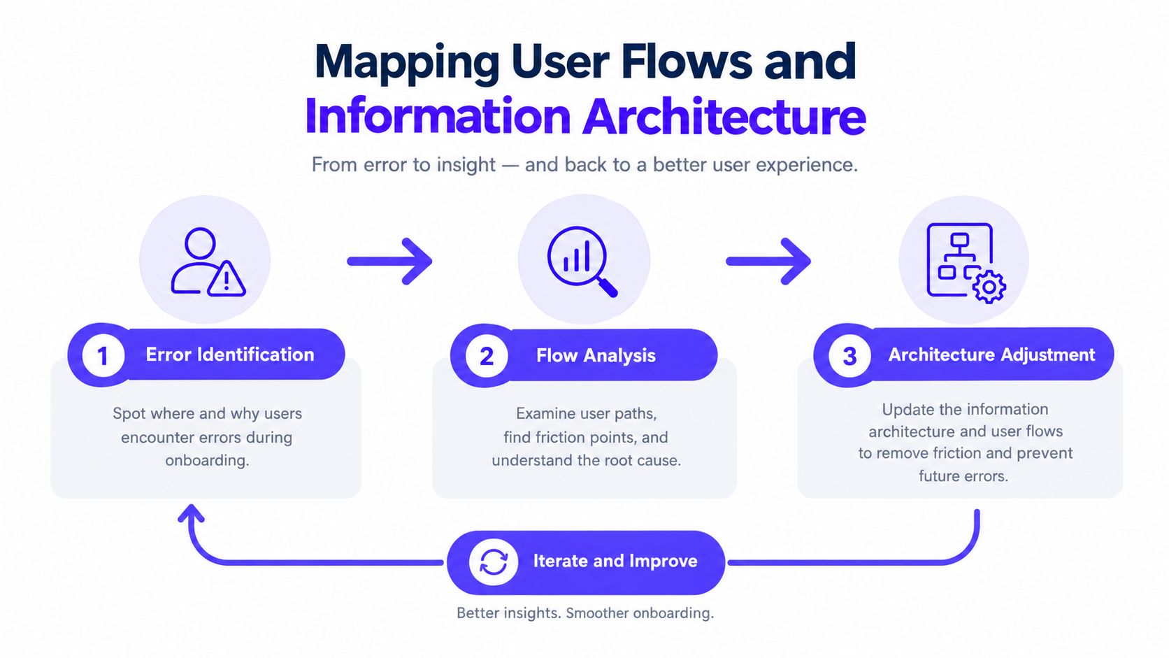
Start with the user's job, not the dashboard. A founder may describe a product as an AI underwriting platform, a crypto treasury tool, or a financial operations workspace. The user experiences a sequence of decisions: find an account, review information, resolve an issue, approve an action, and understand what happened afterward.
Map that sequence before choosing navigation labels or card layouts. Include the normal path and the uncomfortable paths that stakeholders usually postpone.
Begin with tasks and exceptions
Choose one target segment and write the task in observable terms. “Manage finances” is too broad. “Review a flagged transaction, inspect its supporting evidence, and approve or reject it” gives the team something testable.
Then map each point where the system can change state:
Entry: What does the user know before starting?
Action: What does the user provide, select, connect, or approve?
System response: What does the product calculate, generate, verify, or reject?
Decision: What must the user understand before continuing?
Recovery: What can the user correct, undo, retry, or bypass?
Outcome: How do they know the task is complete?
AI products need explicit handling for confidence and provenance. Users should be able to distinguish generated content from verified information, inspect sources where appropriate, revoke permissions, and continue through a non-AI route when automation isn't suitable. Recent UX research makes the same case for explicit confidence, provenance, consent, human review for high-impact actions, and accessible non-AI fallbacks in AI SaaS and fintech interfaces. Research on designing AI interactions is useful because it treats the interface as a supervised system rather than a collection of generated screens.
Build an architecture that reveals priority
Information architecture should help users answer, “What needs my attention now?” A dashboard that gives every metric equal visual weight forces users to perform the prioritization themselves.
Group information by user decisions and frequency. Put urgent exceptions near the primary workspace, keep reference material available without making it dominant, and use progressive disclosure for advanced settings. An administrator may need permissions, audit history, and configuration controls. An analyst may need evidence, filters, and export actions. Those users may share a product, but they shouldn't receive the same starting structure.
A practical architecture review asks:
Can a new user identify the next action without training?
Can an experienced user reach frequent tasks without opening multiple layers?
Can the user understand why an action is blocked?
Does the navigation preserve context after an error or permission change?
Can the user finish the task if the AI is unavailable?
The information architecture guide from 925 Studios offers a useful reference for organizing complex products around findability and task structure. The key deliverable isn't a sitemap that looks tidy. It's a flow where users understand what the product knows, what it needs, and what they can do next.
Wireframing and Prototyping Core Workflows
Wireframes are structural tests. Their value comes from exposing missing decisions while the cost of changing them is still low.
A useful wireframe for a fintech onboarding flow should show required documents, verification status, error recovery, and the next action. A useful prototype for an AI workspace should show an empty state, a generated result, a low-confidence result, a source inspection panel, an edit path, and a failed generation state. Styling can wait. Behavior can't.

Prototype the expensive mistakes first
Don't prototype every feature at the same level of detail. Select the workflows where a bad decision creates the most engineering, revenue, or compliance risk.
For a SaaS product, that may be workspace creation, role assignment, or first-value activation. For fintech, it may be identity verification, payment setup, or transaction approval. For Web3, it may be connecting a wallet, reviewing a contract interaction, and recovering from a rejected signature.
Within each flow, make requirements visible early:
Show total commitment: Expose cost, permissions, timing, and required information before the final confirmation.
Preserve user input: Don't erase a carefully completed form after one validation error.
Validate inline: Explain a problem beside the field or action that caused it.
Use meaningful defaults: Reduce effort without making high-risk decisions behind the user's back.
Define every state: Include loading, empty, success, error, disabled, permission-denied, and interrupted states.
Checkout research provides a useful warning about workflow friction. Baymard reports a global average cart-abandonment rate of approximately 70.19%, and its usability studies found about 32 checkout improvements available on the average large-scale ecommerce site, with potential conversion gains of roughly 35% through better checkout UX. These figures describe ecommerce, not SaaS or fintech, but the underlying lesson transfers directly: high-intent users still abandon tasks when requirements, costs, errors, or next steps remain unclear. Baymard's checkout usability research explains the interaction problems in detail.
Make prototypes answer decisions
A clickable prototype should help the team answer specific questions. Can a first-time user tell whether an AI result is ready for review? Can an administrator understand which permission blocks an action? Can a customer correct a failed payment without restarting?
Avoid prototypes that only demonstrate the ideal path. Add realistic content, long names, missing data, conflicting values, and interrupted actions. Technical founders often learn more from a prototype that shows a rejected transaction than from a polished landing screen.
The best handoff from this phase isn't “the screens are approved.” It's a short list of validated behaviors, unresolved risks, and implementation constraints. Engineering can then estimate the actual work instead of estimating a visual illusion.
Visual Design and Accessible Design Systems
A design system is an operating tool, not a color library. It gives product designers and frontend developers shared rules for components, states, spacing, typography, content, and accessibility.
Start with the components that carry product risk: inputs, tables, filters, dialogs, navigation, alerts, buttons, and status indicators. Define their default, hover, focus, error, success, loading, disabled, and permission-related states. If those states aren't documented, developers will fill the gaps differently across the product.
Turn accessibility into a design decision
Accessibility needs to exist in visual design and component behavior, not only in a release checklist. WCAG 2.2 requires visual information needed to identify interface components and their states to reach at least a 3:1 contrast ratio against adjacent colors. A computed value of 2.999:1 does not pass, because the result can't be rounded up. The WCAG 2.2 non-text contrast guidance covers controls, focus indicators, icons, and state changes that users need to perceive.
That rule matters in a dashboard where a pale border indicates an input, a subtle color shift marks a selected filter, or a faint outline shows keyboard focus. If the state is important, color alone shouldn't carry the entire meaning. Add clear labels, shape, position, text, or another visible cue.
Text has separate contrast requirements. WCAG Level AA sets a minimum 4.5:1 ratio for normal text and 3:1 for large text, while Level AAA uses 7:1 for normal text and 4.5:1 for large text. The WCAG contrast minimum guidance provides the criteria designers and developers should use when defining brand colors.
Build rules developers can use
A working system should answer implementation questions without forcing a developer to interpret a screenshot. Document component anatomy, spacing behavior, content limits, responsive behavior, keyboard interaction, and state transitions.
Use a small set of deliberate tokens for color, type, spacing, radius, elevation, and motion. Then connect those tokens to components and test them on real backgrounds. A transaction status should remain understandable in a dense table, a mobile layout, and a dark theme if the product supports one.
A good design-system review checks:
Component coverage: Are repeated patterns represented as reusable components?
State coverage: Can developers implement success, error, loading, focus, and disabled states?
Content resilience: Does the layout survive long labels, translated copy, and missing values?
Assistive technology: Have keyboard navigation and screen-reader behavior been considered?
Brand consistency: Do product UI and marketing surfaces use the same underlying visual logic?
The accessibility design guidance from 925 Studios is a useful reference for connecting inclusive design with shipped product quality. The practical advantage of this approach is reduced interpretation. Designers stop redrawing the same patterns, and developers stop guessing what a component should do.
Testing and Iterating with Real Users
Stop asking users whether they like the screens. Watch them attempt a task.
Preference is weak evidence for a product decision. Behavior is stronger. A user who says a workflow looks clear but misses the primary action during a realistic task has revealed a design problem that a positive interview answer won't expose.
Use small rounds, not one final exam
Jakob Nielsen and Thomas Landauer's 1993 mathematical model established a foundation for focused usability testing. Later guidance based on that work reported that five users can reveal roughly 85% of usability problems in a relatively homogeneous user group. Nielsen's explanation of the five-user model also makes clear that the result depends on the participant group and doesn't apply universally across materially different users.
The useful operating model is iterative:
Select one segment and one high-risk task.
Recruit roughly five representative participants from that segment.
Observe where they hesitate, fail, abandon, or express uncertainty.
Group recurring problems and rank them by task impact.
Fix the highest-cost issues.
Test the revised flow with another small cohort.
Don't combine an administrator, a novice customer, an experienced analyst, and an institutional investor into one supposedly representative sample. Segment by role, expertise, risk context, and accessibility needs. If those groups behave differently, they need separate evidence.
Connect observations to product outcomes
A testing session should produce more than notes. Track task success, critical errors, time on task, abandonment, confidence, and support questions. For an AI product, also record whether users can identify generated content, inspect evidence, correct an output, and recover when the system is uncertain.
A short table can keep the backlog grounded:
Observation | Product risk | Design response |
|---|---|---|
User can't tell why verification stopped | Abandonment and support burden | Explain the missing requirement and preserve entered data |
User accepts generated content without checking evidence | Trust and decision risk | Add provenance, review cues, and confirmation |
User misses keyboard focus in a dense table | Navigation failure | Define visible focus states and test keyboard order |
User repeats an action after a slow response | Duplicate action risk | Show progress, completion state, and safe retry behavior |
The user testing resource from 925 Studios can help teams frame sessions around tasks rather than opinions. Testing becomes commercially useful when each finding points to a change in activation, completion, trust, retention, or support workload.
A founder doesn't need a large research program to learn. They need the right participant, the right task, and enough discipline to fix what the session revealed.
Engineering Handoff and Working with a Creative Partner
A handoff fails when it transfers pictures instead of decisions. Engineers need to know what happens when a component loads, fails, receives unexpected content, loses permission, or moves between responsive layouts.
Give each core flow a clear implementation package:
Behavior notes: Describe triggers, transitions, validation, retries, and confirmation requirements.
State definitions: Show empty, loading, success, error, disabled, offline, and permission-denied states.
Content rules: Specify labels, error messages, truncation behavior, and long-content handling.
Responsive logic: Explain what collapses, reorders, scrolls, or becomes a separate view.
Acceptance criteria: State what must be true for the user to complete the task.
Accessibility requirements: Include keyboard order, focus visibility, semantic structure, and assistive-technology considerations.
Design review should continue during implementation. A screenshot comparison catches spacing issues, but a working review catches deeper problems: a permission error that sends users to the wrong page, a generated result that lacks source context, or a mobile table that hides the action required to continue.
One partner can reduce coordination failure
Early-stage teams often split the work across a product designer, a brand designer, and a frontend developer. That arrangement can work, but it creates handoff points between product logic, visual identity, and implementation. Every handoff introduces interpretation.
An embedded creative partner can keep those decisions connected. The same team can define the product flow, translate the brand into interface rules, build the component system, and implement the frontend. That doesn't eliminate the need for internal product ownership. It gives founders one accountable partner for the path from strategy to shipped pixels.
Evaluate a partner by asking practical questions:
Who owns the workflow model before visual design begins?
Can they show production frontend, not only polished mockups?
Do they define AI uncertainty, permissions, and fallbacks?
How do they test accessibility in components and real flows?
Who handles the gap between approved design and working interface?
Can they support the product after the first release?
For teams comparing external providers, the guide on how to turn invisible vendors into the obvious choice offers a useful framing. Look for evidence of judgment, communication, and implementation discipline, not just attractive portfolios.
925 Studios works across product UI/UX, brand identity, design systems, websites, and frontend implementation for AI SaaS, Web3, and fintech companies. That integrated model gives a startup one creative partner in place of three separate hires, while keeping product behavior, brand expression, and shipped interface work aligned.
925 Studios can help you map high-risk workflows, prototype AI and fintech product states, build accessible design systems, and carry the work through frontend implementation. If your team needs one partner across product design, brand, and build, visit 925 studios to discuss the product you're preparing to ship.
Let’s keep in touch.
Discover more about high-performance web design. Follow us on Twitter and Instagram.

