
How to Design Dashboards Founders Actually Use

Outrank AI

The popular advice about dashboard design is wrong in one important way. A dashboard doesn't become useful because it contains attractive charts, polished KPI cards, or a clever layout. It becomes useful when a specific person can answer a specific business question and act without hunting through the interface.
That distinction matters for AI SaaS, Web3, and fintech teams. Founders need to know whether the product is healthy. Growth leaders need to know which funnel is breaking. Finance needs to understand whether revenue quality is improving, not just whether the topline is rising. Each role needs a different decision surface, even when the underlying data is shared.
The practical approach to how to design dashboards is therefore simple: start with the decision, then design the shortest path to it. Everything else, including the grid, chart type, filters, interaction model, and visual style, should reduce decision latency.
Table of Contents
Why Most Dashboards Fail Before the First Pixel
A dashboard fails before anyone opens Figma when its scope has no owner. A founder requests company health, sales wants pipeline visibility, finance wants revenue reporting, and product wants usage analytics. The designer combines every request on one surface, then tries to repair the resulting confusion with color, spacing, and more filters.
The screen becomes a queue of unresolved questions. A founder reviewing an AI SaaS dashboard may see signups, model usage, churn, cash, pipeline, support volume, and campaign performance at once. If a renewal risk appears, they still have to decide which number matters, who owns the response, and where to investigate. The combined view looks complete, but it slows the meeting and postpones action.
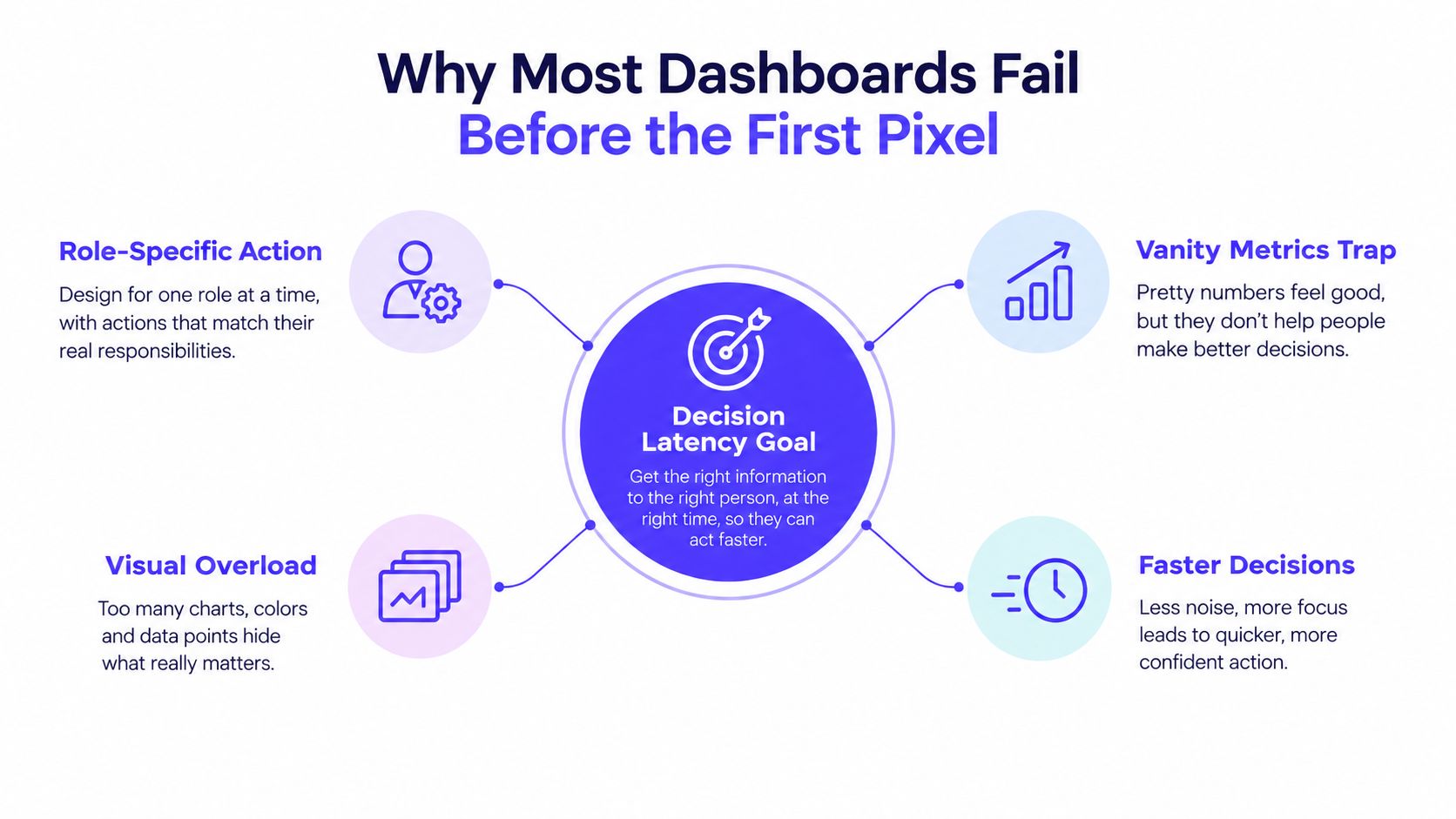
The three failures that happen first
Data dumps expose every available metric and leave interpretation to the user. The dashboard retrieves information, but does not show what changed, why it matters, or what someone should do next.
Metric sprawl begins with reasonable requests. One stakeholder adds a chart, another adds a filter, and the screen gradually represents every department without supporting a clear workflow.
Unfiltered analytics exports create false confidence. A metric pulled from Amplitude, Stripe, Mixpanel, or a warehouse may be accurate and still have no defined action attached to it.
Practical rule: If a KPI has no named owner and no named decision, remove it from the primary screen.
A screen should earn its space by helping one role complete one recurring task. That requirement shapes the hierarchy, the default date range, the alert threshold, and the path into detail. It also gives designers a testable standard: remove an element if it does not help the owner interpret a change or choose a response.
Founders often fund visual polish because polish is easy to show in a review. Usability is harder to demonstrate, so teams under-test it. Research evaluates dashboards through usefulness, operability, learnability, ease of use, task suitability, situational awareness, satisfaction, interface quality, content, and system capability, rather than aesthetics alone. A 2023 systematic review and usability research summarized by Luzmo's dashboard research overview reflect that broader standard. One interactive surgical dashboard study reported a System Usability Scale score of 82.9, compared with 63.5 for an existing dashboard, with p = 0.006. Use the scores as evidence that testing matters, not as a target to copy.
For paid acquisition teams comparing top Google Ads dashboard tools, judge the product by the decision it supports. The useful screen helps a growth owner decide what to pause, investigate, or fund next.
Discovery Talks That Surface the Right Metrics
Start discovery with decisions, not a request for “all the important metrics.” Talk to the people who make or support decisions, then ask them to describe the last time data changed their behavior.
The CEO or founder should answer: What did you decide last week based on a dashboard? What number made you act? What did you still need to ask someone else? These questions reveal whether the executive view needs a health signal, a trend, or an exception list.
The head of sales or growth needs a different conversation. Ask: Which change makes you reallocate budget? Which funnel stage do you inspect when bookings fall? What report do you still export to Google Sheets? A sales leader may not need every campaign metric. They may need a clear answer about pipeline quality, conversion movement, or lead response.
Finance should identify the numbers that affect cash and planning. Ask which metric causes a forecast change, which revenue slice needs reconciliation, and where the team still combines data manually. A power user of the product can expose product signals that leadership misses, such as workflow abandonment or a feature that creates repeated support requests.
Support and customer success representatives are equally important. Ask what customers struggle to understand, which account signal triggers outreach, and what they check before escalating an issue. These conversations often uncover operational metrics that don't appear in analytics tools.
Turn interviews into decision records
Use a short discovery note for every meaningful answer:
Decision: What choice does the person need to make?
Trigger: What change or threshold prompts attention?
Metric: Which number supports the decision?
Owner: Who acts on it?
Next step: What happens after the dashboard surfaces it?
This keeps the team from confusing a metric with a requirement. “Show active users” is not a decision. “Decide whether onboarding needs intervention” is a decision that may require activation, retention, and segment context.
Use these user research methods when interviews need more structure, especially if different roles describe the same workflow in conflicting ways. Don't average their needs into one generic screen. Create role-specific views or progressive disclosure, so the founder sees the business signal while the operator can inspect the cause.
No KPI should reach the shortlist without a named decision and named owner. If the owner says, “We just like having it,” treat that as a warning. Reassuring numbers that never change behavior are decoration.
Picking KPIs That Change a Decision
A KPI earns its place by changing what someone does on a Monday morning. If removing the metric wouldn't alter the conversation, remove it from the primary view.
The first pass should be ruthless. Write every candidate metric on a shared board, then ask one question: Would this number cause a different action in the next leadership review? If the answer is no, move it to a diagnostic view or delete it. Don't let an analytics tool's default event taxonomy determine your product hierarchy.
Use three KPI tiers
Primary is the single number that defines whether the screen is healthy. For an AI SaaS founder, that might be net revenue retention or successful workflow completion, depending on the business decision. For a fintech operator, it might be funded volume, but only if that number governs the next operational choice.
Secondary metrics support or contradict the primary signal. They provide comparison and context, such as new business, expansion, failed payments, activation, or support volume.
Diagnostic metrics explain why the primary signal moved. They belong in drill-downs, detail panels, or investigation views. They shouldn't compete with the main decision.
AI SaaS teams often track token volume without transaction count, which can make usage look strong while hiding whether customers complete valuable work. Web3 teams can show transaction volume without distinguishing network activity, user retention, or failed transactions. Fintech teams can celebrate MRR without showing gross margin, or monitor DAU without activation rate. These pairs aren't universal KPI sets. They're reminders to test whether the metric represents value, quality, or merely activity.
A large-scale census of 25,620 Tableau Public dashboards found that real-world dashboards tend to converge on a limited set of core building blocks. The related dashboard research supports a useful conclusion: successful dashboards are usually compositionally simple, with visual choices aligned to the user's workflow.
Fill this out before wireframing
Metric | Decision It Changes | Owner | Tier |
|---|---|---|---|
Primary business signal | What action changes if it moves? | Named role | Primary |
Supporting metric | What does it confirm or challenge? | Named role | Secondary |
Investigation metric | What could explain a change? | Named role | Diagnostic |
Keep the worksheet small enough to complete in one working session. A systematic review of dashboard design patterns across 144 dashboards identified recurring patterns around defining the task, selecting task-relevant indicators, organizing charts, and adding interaction only where it reduces complexity. It also identified clutter and excessive data in one view as a recurring failure mode. The University of Edinburgh research summary reinforces the rule: prioritize the decision before you prioritize the data.
Grid, Layout, and the Top Left Rule
Use a 12-column grid with 8px spacing tokens. The grid gives engineering predictable zones, while the spacing system prevents every card from acquiring its own arbitrary padding and margin.
Call the placement convention an F-pattern dashboard. Put the most important answer in the upper-left area, then reveal supporting information as the eye moves left to right and top to bottom. Microsoft's Power BI dashboard design guidance recommends placing the highest level of data in the top-left, and Tableau's visual best practices make the same placement recommendation.
Build the hierarchy
Reserve the top-left quadrant for the KPI that drives today's action. Let it span three columns, and give it emphasis through size, contrast, or a clear delta callout. Don't hide it inside a carousel. A founder shouldn't swipe to discover whether the business is healthy.
Place secondary metrics below in equal cards, three or four across, so users can compare them without adjusting to different card heights. Use the right two-thirds for trend and breakdown charts. A time series can run across the available width, with a composition or category breakdown beside it.
The bottom band belongs to tables, logs, and drill-down widgets. These elements earn their space only when they help someone investigate or act. If a table merely repeats the chart above it, remove it.
Layout test: Cover the labels and ask someone to point to the metric that deserves attention. If they can't identify it immediately, the hierarchy isn't doing its job.
Three traps damage otherwise solid layouts:
Carousel heroes: Important metrics disappear behind interaction.
Mixed card heights: Misaligned edges make comparison slower.
Corner padding: Charts shrink into awkward spaces because the grid was treated as a loose suggestion.
Use the same convention across investor, operations, and admin views, then adjust density for the role. GTM sales dashboards with KPIs can provide useful reference points for deciding which sales signals deserve the first scan. For more SaaS-specific patterns, compare the SaaS dashboard design examples for 2026, then reject any pattern that doesn't support a real decision.
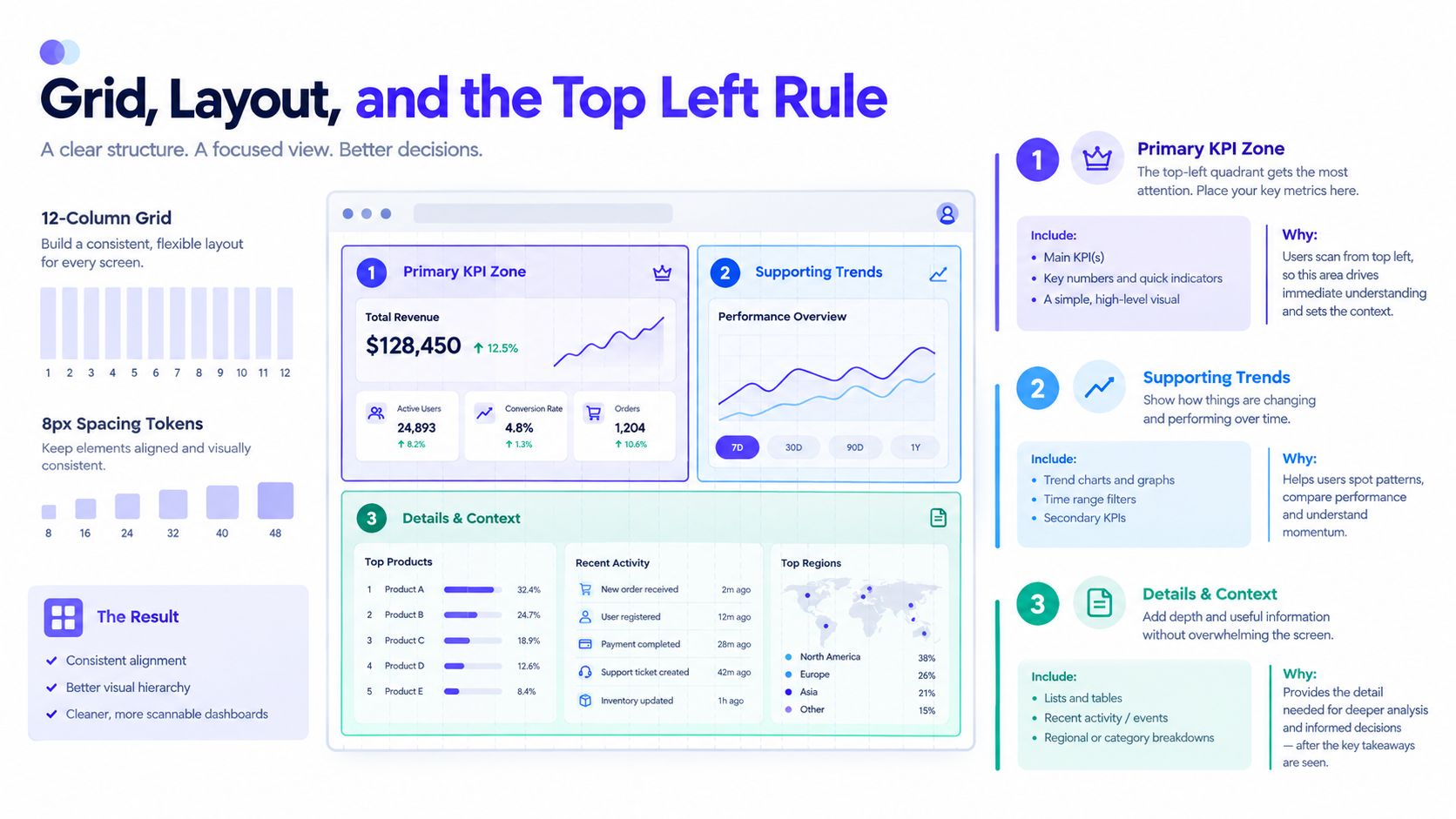
Chart Selection by Question Type
A chart earns its place by shortening the path from question to decision. Start by naming the single decision this screen supports, then choose the visual that answers it with the least interpretation. People compare position most accurately, followed by length and angle. Area and color work better for grouping or emphasis than for close value comparisons. Setproduct's dashboard UI guidance supports this visual hierarchy.
Question Type | Best Chart | SaaS/Fintech Example | Avoid When |
|---|---|---|---|
How is it changing over time? | Line chart | MRR growth or API latency p95 | The time series has no meaningful order |
Which category is higher? | Horizontal bar | Churn by plan tier or gas fees by chain | Labels are short and the comparison is not categorical |
How do parts make up a whole? | Stacked bar or 100% stacked bar | Revenue mix across periods or wallet allocation | Users need precise ranking of many segments |
How spread out are the values? | Histogram or box plot | Latency spread or trade size | The audience needs a simple total, not distribution |
Are two measures related? | Scatter or bubble chart | Active users versus revenue or TVL versus volume | The relationship is not useful for an action |
Make each visual earn its place
Use a line chart for MRR growth when a founder must judge direction, momentum, or a change against a target. Add a baseline or operating band so the movement has context. Skip the line when the categories are unordered or the user needs only a point-in-time comparison.
Choose a horizontal bar chart for churn by plan tier. Plan names remain readable, and ranking is immediate. The same form works for gas fees by chain, helping an operator compare categories without decoding a legend.
Use a stacked bar when the decision depends on composition across periods, such as whether revenue mix is shifting. A treemap can show portfolio allocation or wallet holdings with 8 or more segments, but similarly sized areas are difficult to compare precisely. Use it for broad composition, not exact ranking.
A donut looks friendly but hides ranking. Keep it for an empty state or a single-metric share screen, not a crowded executive overview. For distributions and outliers, use a histogram or box plot instead of a pie. For relationships, a scatter plot can show whether active users and revenue move together, while a bubble chart adds a third dimension such as TVL.
Bar charts, line charts, and maps appear frequently in working dashboards because users already understand their basic reading patterns. Familiar forms reduce interpretation cost, which matters when an AI SaaS or fintech team needs to act before the next refresh.
If the question starts with “how is X changing,” use a line.
Interaction, Filtering, and Real Device Behavior
A dashboard that loads well on a desktop connection but struggles on cellular gets screenshotted and forgotten. Real users open dashboards from laptops, phones, office networks, and slow hotel Wi-Fi. The interface has to survive the conditions in which decisions happen.
Start with a persistent global filter bar for date range, segment, and environment. Add local controls only when a chart needs a different slice. Preserve filter state in the URL, so a founder can share the exact view with a colleague instead of sending a screenshot with no context.
Make interaction predictable
Desktop users need hover tooltips. Mobile users need tap-to-reveal details and touch targets that don't require precision. Cross-chart brushing can connect cause and effect, such as selecting a period on an MRR chart and highlighting the same window in churn.
Responsive behavior should be explicit:
Below 1024px: Collapse the three-column secondary row into a vertical stack.
Below 640px: Show one hero metric followed by one chart in the primary mobile view.
Below the fold: Lazy-load widgets that aren't needed for the first decision.
Cap the initial widget load at 6, cache aggregations, and show skeleton states instead of spinners. A skeleton tells users where content will appear and gives the layout a sense of stability while data arrives.
Accessibility needs the same product attention as interaction. Use a minimum 4.5:1 contrast ratio, visible focus states on every interactive card, ARIA labels for charts, and a tabular fallback for screen readers. The visual dashboard isn't the only interface. Keyboard navigation and semantic data access matter for users who don't consume charts visually.
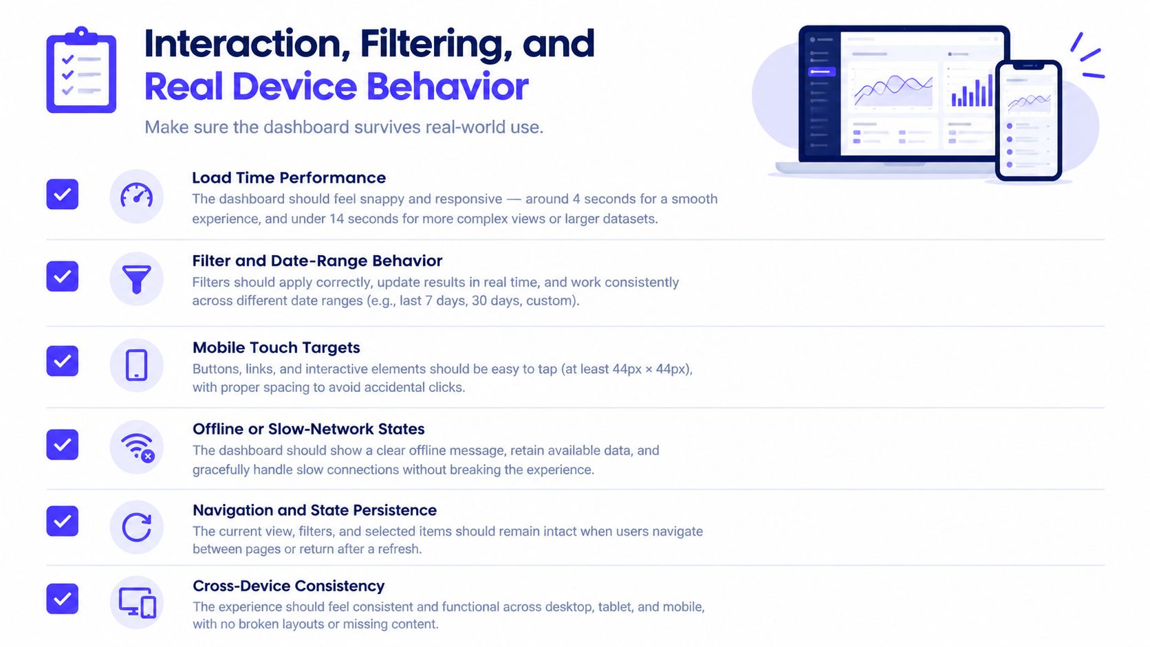
Set three load-time budgets before development starts. The first should cover the initial shell, the second should cover the primary KPI and main chart, and the third should cover below-the-fold investigation content. The exact budgets depend on the product and data pipeline, but the team must agree on them before “performance” becomes a vague post-launch complaint.
Use user flow examples to connect these states to the actual journey. A filter that changes the URL, a chart that opens a detail panel, and an error state that explains what happened are all parts of the flow, not isolated interface details.
Design System, Testing, and Handoff Checklist
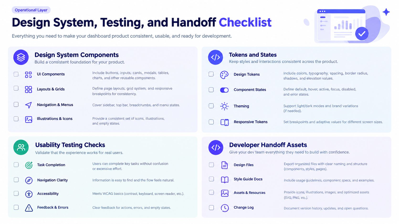
A dashboard becomes a product surface when the team can extend it without redesigning every card. Standardize the components that carry meaning before shipping v1:
KPI tiles with label, value, comparison, timestamp, and status.
Chart wrappers with title, description, source state, and action area.
Filter bars with global and local behavior.
Empty, loading, partial-data, and error states.
Responsive card primitives that preserve hierarchy across widths.
Set tokens before the screen grows. Define spacing, typography hierarchy, border treatment, and color semantics for positive and negative deltas. Tie chart palette rules to the brand, but give each data series a distinct visual signal. The system should feel like the product while keeping interpretation clear and reducing the time required to choose an action.
Test the decision, not the decoration
Run 5 founder-style tasks per role. Ask the CEO to identify the business risk, the growth lead to find the underperforming segment, the finance lead to explain a revenue movement, the product user to locate a workflow problem, and the support representative to identify an account needing attention.
Use think-aloud sessions, then review the results against the decisions recorded during discovery. Watch for hesitation, incorrect interpretation, missed filters, and actions users cannot find. Test whether each screen supports its intended decision with minimal delay. A usability review should measure usefulness, learnability, operability, satisfaction, and task suitability rather than collect compliments about visual style.
Require a complete handoff
Before approving v1, request these artifacts:
Figma component specifications: States, variants, spacing, type, and responsive behavior.
Developer notes: Data contracts, loading assumptions, empty states, error handling, and edge cases.
Chart library decision: The selected library and why it fits the product's interaction and accessibility needs.
Accessibility summary: Contrast checks, keyboard behavior, chart labels, and tabular fallbacks.
Acceptance criteria sheet: Signed-off behavior for filters, permissions, breakpoints, loading, and error states.
A reusable system saves design time and keeps the product coherent as metrics, roles, and workflows expand. For additional examples of actionable SaaS dashboards, study the decisions each surface supports instead of copying its visual treatment.
925 Studios helps AI SaaS, Web3, and fintech teams turn complex product data into clear dashboard experiences, combining product design, brand design, and frontend development within one creative partner. If your dashboard needs a sharper decision flow, a stronger design system, or a shipped interface from strategy through frontend, visit 925 studios and start with the screen your team needs to use every Monday.


Let’s keep in touch.
Discover more about high-performance web design. Follow us on Twitter and Instagram.

