
7 Design Case Studies for AI, SaaS, and Fintech

Outrank AI

A polished screen isn't enough to teach a startup team how to make better decisions. GE Healthcare's Adventure Series redesign turned MRI scans into an adventure for children, and one site reported that fewer than 27% of children needed sedation, compared with almost every child before the redesign. The same case study reported an approximately 90% increase in patient satisfaction, alongside higher throughput and fewer canceled or postponed scans. The GE Healthcare case study is useful because it connects experience design with operational and human outcomes.
That's the standard used throughout this list. A useful design case study explains the context, business goal, research, strategy, UX structure, visual system, key screens or before-and-after evidence, outcomes, trade-offs, and one action another team can reuse. The seven sources below serve different jobs, from rigorous UX research and conversion evidence to studio process and portfolio storytelling.
For founders, 925 Studios represents the end-to-end model. One creative partner covers product design, brand design, and frontend delivery, helping AI SaaS, Web3, and fintech teams turn complex products into clear, conversion-focused experiences without immediately hiring three separate specialists.
Table of Contents
1. AI & B2B SaaS Product Design Case Studies | 925 Studios
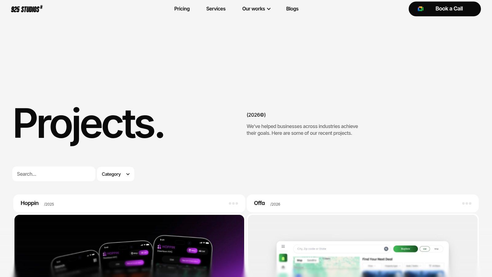
The 925 Studios design case studies hub is built for a decision-maker who needs to assess fit quickly. Instead of presenting design as isolated screens, it brings together app design, web design, branding, design systems, and shipped frontend work across AI, SaaS, Web3, and fintech.
That range matters for technical startups. A founder may need a product dashboard that makes an AI workflow understandable, a marketing site that explains the value clearly, and a brand system that keeps both experiences consistent. Hiring separate specialists can create handoff gaps between strategy, interface design, visual identity, and implementation. 925 Studios positions itself as one senior creative partner replacing a product designer, brand designer, and frontend developer.
What the hub helps you evaluate
The portfolio is intentionally skimmable. Category tags and project previews let a product leader compare relevant work before committing to a deeper conversation. You can look for evidence of:
Product complexity: Does the work make dense SaaS, AI, or fintech workflows easier to understand?
System thinking: Does the case show reusable components, interaction rules, and a visual language rather than disconnected screens?
Brand-to-product consistency: Does the identity survive inside the dashboard, onboarding flow, website, and sales experience?
Production awareness: Does the final work appear designed for frontend implementation, not only for a presentation deck?
The strongest use of this resource is visual and strategic benchmarking. It can help a founder identify what “clear” might look like for a technical product, compare dashboard patterns, and spot how a studio moves from positioning to interface. It's less useful if you need a fully disclosed experiment, sample size, retention analysis, or detailed pricing information. Public portfolio work often emphasizes the final experience and project scope, so serious buyers should ask for baseline metrics, constraints, implementation ownership, and what changed after launch.
Practical rule: Treat a portfolio as proof of capability, not automatic proof of business impact.
Best fit for startup teams
925 Studios suits funded startups and scaling B2B teams that need senior design and build capacity without a long internal hiring process. The value isn't limited to attractive UI. A single embedded team can connect product strategy, UX, brand identity, design systems, and production-ready frontend so the shipped experience doesn't lose quality between departments.
The trade-off is clear. 925 Studios isn't a substitute for a full internal engineering organization when a company needs long-term product engineering scale, infrastructure work, or ongoing feature ownership. It is a strong fit when the immediate problem is turning a complex product into a coherent, credible, usable experience.
2. Nielsen Norman Group
Nielsen Norman Group is the strongest choice in this list when you need evidence before inspiration. Its free articles and paid research reports examine usability, information architecture, product behavior, enterprise workflows, and UX measurement. The material is less about presenting a perfect portfolio and more about explaining why a design decision works, where it fails, and how a team can test it.
That makes NN/g especially useful for AI SaaS and fintech products, where a smooth interface can still hide confusion. A founder designing an AI recommendation flow should ask whether users understand the recommendation, know what data informed it, and can recover when the system is wrong. A fintech team should separate task completion from confidence, trust, and error comprehension.
For qualitative usability research, NN/g describes five participants as a practical starting point when they belong to the same target audience and perform comparable tasks. Its usability-testing guidance also distinguishes that approach from statistical measurement, where a larger sample is needed. The useful lesson isn't to worship a sample-size rule. It's to test a focused workflow, fix the clearest problems, and test again.
Where the research becomes actionable
Use NN/g to strengthen the evidence section of your own design case studies. Document the task, participant type, observed problem, design change, and follow-up result. If your product serves materially different groups, such as a fintech administrator and an end user, don't combine their feedback into one vague audience.
A user research methods guide from 925 Studios can help translate that thinking into a practical product process. NN/g supplies the research discipline, while a studio workflow can connect the findings to wireframes, visual design, and frontend delivery.
The limitation is that much of the deepest material is paid, and some examples reflect large-organization constraints. A small startup won't always have the same governance structure, research budget, or release process. Still, the recommendations are highly reusable because they focus on user behavior and decision quality rather than organizational size.
3. Case Study Club
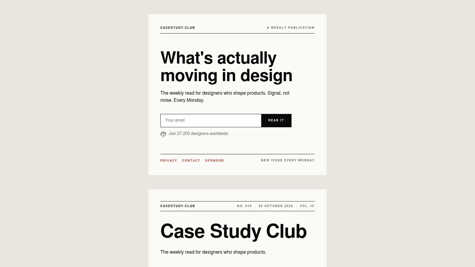
Case Study Club works best as a pattern library for people who need to study how strong design narratives are assembled. Its curated collection brings together UX, UI, product design, portfolio examples, writing resources, and templates. The value isn't only in seeing polished work. It's in comparing how different designers frame the problem, show the process, and describe the result.
For a startup team, that distinction matters. A portfolio page can look impressive while leaving out the information a buyer needs, such as the original constraint, the rejected direction, the implementation challenge, or the reason a particular flow changed. Case Study Club makes it easier to spot those narrative patterns across many examples.
Useful for writing, weaker for proving outcomes
The platform's filters help you find relevant work without browsing an undifferentiated gallery. Its portfolio tools, templates, AI-assisted writing features, community resources, and newsletter can also help a small team turn scattered project notes into a readable case study.
That's useful for a founder preparing a launch story or a product leader documenting a redesign for sales, hiring, or internal alignment. A practical case study might show the old onboarding path, the research finding that exposed friction, the new decision structure, and the product behavior that changed afterward.
The weakness is source quality. Individual case studies vary because contributors control the evidence and level of detail. Some are rigorous, while others mainly present polished screens and a persuasive narrative. Paid membership is also required for the strongest features, including higher-level support and review options.
A case study should help a reader make a decision, not just admire the author's taste.
Use Case Study Club for structure and inspiration, then verify claims against product analytics, usability sessions, support data, or experiment records. For AI SaaS, that might mean checking whether a redesigned prompt builder improves successful task completion. For Web3, it could mean examining whether the wallet connection flow reduces uncertainty without hiding important security information.
4. Growth.Design
Growth.Design is a good resource when the design problem is tied to activation, retention, pricing, onboarding, or conversion. Its narrative teardown format breaks down familiar product experiences through behavioral science and conversion psychology. The visual format is easy to consume in a product review or founder briefing, and the examples often show how small decisions influence what users notice and do next.
That format is particularly useful for AI SaaS teams. Activation can depend on whether a user reaches a meaningful result quickly, understands what the system can do, and sees a clear next action after the first output. A fintech product can use the same lens to inspect pricing disclosure, verification, consent, and recovery when an application stalls.
Turn psychology into a product test
The free teardowns are best treated as hypotheses, not instructions to copy. A pattern that works in a consumer product may be unsuitable for a regulated financial workflow. Dark patterns, excessive urgency, concealed defaults, or ambiguous consent can produce a short-term click while damaging trust and creating compliance risk.
The 925 Studios guide to conversion optimization techniques provides a complementary product-design lens. The practical move is to take one observed pattern and translate it into a testable change:
Onboarding: Clarify the first successful action and remove choices that don't help the user reach it.
Pricing: Make plan differences and usage boundaries understandable before signup.
Retention: Give users a visible reason to return, without manufacturing anxiety or artificial scarcity.
AI interactions: Explain what the system did, what the user can change, and what happens when the output is uncertain.
Growth.Design's premium masterclasses, downloadable assets, checklists, and certifications go deeper, but some materials sit behind paid programs and enrollment may depend on cohort availability. The resource is strongest for generating and communicating growth hypotheses. It isn't a replacement for your own user research, accessibility review, or long-term retention analysis.
5. Awwwards
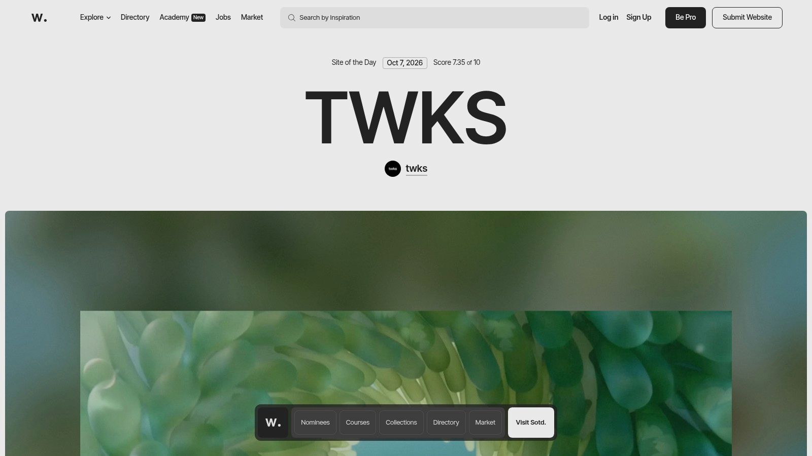
Awwwards is the right place to study frontend craft, brand expression, and high-impact marketing experiences. Its case studies often come from the studios that built the work, so they can reveal design decisions, technology choices, interaction details, and implementation trade-offs that a static awards gallery can't show.
This makes the resource valuable for a fintech launch site, an AI company rebrand, or a Web3 product that needs to communicate technical credibility without becoming visually obscure. You can study how a team uses motion, typography, layout, WebGL, 3D, and responsive behavior to create a memorable entry point.
Separate spectacle from shipped performance
The risk is copying the surface. A visually ambitious interaction may be right for a brand launch and wrong for a dashboard where users need to compare balances, review transactions, or complete a time-sensitive task. Awwwards is more focused on marketing and frontend experiences than on deep product UX, so founders should not treat an award-winning landing page as evidence that the underlying product is easy to use.
Performance needs to be part of the review. Google's mobile research found that 53% of mobile visits were abandoned when a page took longer than three seconds to load, a benchmark from its cited 2016 research summarized by this source on site speed. That doesn't predict every audience or device, but it shows why a heavy hero animation can undermine the conversion goal it was meant to support.
Ask four questions when reviewing an Awwwards example:
What is the job of the interaction? Does it explain, orient, build confidence, or only decorate?
What loads first? Can a visitor understand the offer before secondary media finishes loading?
What happens on mobile? Does the experience remain usable without the same screen size or connection?
What can the product team maintain? A striking effect that nobody can update becomes a liability.
6. Baymard Institute
Baymard Institute is the most practical source here for payment, checkout, subscription, and form-heavy experiences. Its research focuses on e-commerce flows, but many findings transfer directly to fintech and SaaS products. A subscription upgrade, account verification journey, payment setup, or billing correction has the same underlying challenge: users need to understand what's required, what went wrong, and what happens next.
The research is valuable because it examines interfaces at the point where small ambiguities create abandonment or support work. A field label, error message, address step, payment option, or confirmation state can determine whether a user completes the task or loses confidence.
A strong fit for fintech product reviews
Baymard's benchmarks and case-style analyses show common patterns across major stores, while its regularly updated guidelines connect observations to specific interface decisions. Team access provides deeper research and page-level examples, but the full catalog requires paid access.
The e-commerce focus is also the limitation. Baymard won't give a complete framework for brand positioning, enterprise permissions, AI explainability, or the operational reality of a Web3 wallet. It is a specialist tool, not a general design partner.
Use it when the business problem is close to money changing hands. Compare your current flow with the research, identify the exact point of uncertainty, and record the change in a design case study. Don't write “we improved checkout.” Show which step created confusion, what you changed, and whether the change affected completion, error recovery, support burden, or trust.
Accessibility belongs in this review too. WCAG 2.2 requires normal-sized interface text to meet a 4.5:1 contrast ratio against its background for Level AA, while large text has a 3:1 minimum. A fintech brand color that works in a logo may fail in a form label, error message, or disabled-looking control, so test the actual component rather than the brand board.
7. frog, part of Capgemini Invent
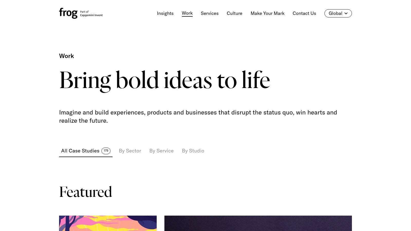
frog's public work is useful when the product challenge involves multiple stakeholders, regulated environments, service design, and organizational change. Its case studies span fintech, healthcare, mobility, emerging technology, brand, product, and strategy. The strongest examples connect research and positioning to the delivered experience instead of treating the interface as the entire project.
That broader lens matters for founders moving from a prototype to a serious product. A fintech onboarding flow might involve compliance, operations, customer support, risk, engineering, and marketing. An AI platform may need a new brand, a permissions model, an admin experience, and a clearer explanation of how automated decisions work. A case study that only shows the end-user screen misses much of the work that determines whether the product can ship.
Look for trust, not only transformation
The frog work portfolio is useful for executive-level pattern recognition. It shows how mature teams frame complex programs and communicate research-to-delivery arcs. The trade-off is disclosure. Client confidentiality often keeps public case studies at a high level, and the portfolio doesn't function as a transparent pricing or subscription resource.
AI-powered financial products need especially careful scrutiny. Research on responsible AI in fintech identifies bias, privacy, and user trust as central UX challenges. It also reports that real-time insight sections received 68% more attention than static summaries, while intelligent support agents reduced query-resolution time by half and increased satisfaction by 29%. The responsible AI in fintech research makes the important point that simpler visuals aren't always better. Users may need explanations, confidence indicators, audit trails, and recovery paths.
Use frog's work to ask what your own case study is leaving out:
Trust: Can users understand and challenge an automated decision?
Compliance: Does the flow make required information clear without burying the user?
Operations: What does support or internal staff need to handle exceptions?
Accessibility: Can people with different literacy, language, device, and financial backgrounds complete the task?
Top 7 Design Case Studies Comparison
Example | Implementation complexity | Resource requirements | Expected outcomes | Ideal use cases | Key advantages |
|---|---|---|---|---|---|
AI & B2B SaaS Product Design Case Studies (925 Studios) | Medium, engaging an embedded studio; case studies are skimmable | Paid agency engagement; decision-maker review time; minimal hiring overhead | Pixel‑perfect UI, design systems, brand work and shipped front‑end | Funded startups and scaling B2B/AI teams needing fast senior design + front‑end | One partner replaces multiple hires; end‑to‑end delivery; recent, skimmable portfolio |
Nielsen Norman Group (NN/g) | Low–Medium, consume research; apply recommendations | Free articles; paid reports for deep content; product team time to implement | Rigorous, evidence‑based UX guidance and ROI‑oriented recommendations | Product leaders and enterprise teams seeking methodical, research‑backed practices | High credibility and actionable, ROI‑focused insights |
Case Study Club | Low, browse and reuse templates; writing aids speed output | Free access; paid membership for premium features and workshops | Large curated library of case studies plus templates and AI writing aids | Designers building portfolios or documenting projects quickly | Curated examples, templates, and AI tools to accelerate case study creation |
Growth.Design | Low, consume visual teardowns; apply to experiments | Mostly free teardowns; paid masterclasses and assets for deeper learning | Behavioral and conversion insights for activation, retention, pricing experiments | Growth and product teams focused on onboarding, retention, and conversion | Engaging, visual teardowns grounded in behavioral science |
Awwwards (Case Studies) | Medium, reading is easy; implementing high‑craft work is complex | Free case reads; examples often require advanced front‑end/creative skills | Inspiration and technical breakdowns for high‑craft marketing and interactive sites | Teams building marketing sites, brand launches, WebGL/3D interactions | Insight into world‑class craft, tech stacks, and studio practices |
Baymard Institute | Medium–High, applying deep research to product flows can be involved | Paid access for full benchmarks; product/engineering resources to act | Test‑backed benchmarks and actionable guidelines for checkout/conversion flows | Teams optimizing payments, subscriptions, forms, and conversion‑critical flows | Extensive, research‑backed guidance specific to e‑commerce and checkout |
frog (Capgemini Invent) – Case Studies | High, examples reflect large, multi‑stakeholder projects | Agency engagement for complex initiatives; executive stakeholder buy‑in | End‑to‑end case narratives showing research→strategy→delivery | Founders and execs needing examples of multi‑stakeholder or regulated projects | Mature delivery examples across industries; strong research‑to‑delivery narratives |
Turn Inspiration Into a Shipped Design
The strongest design case studies follow a decision, not a decoration. Start by naming the product, audience, and business problem in plain language. “The dashboard looked dated” isn't enough. “New administrators couldn't find the approval queue and contacted support before completing setup” gives a team something it can investigate.
Then record the evidence that shaped the work. Include user interviews, usability sessions, analytics, support conversations, accessibility findings, or sales objections. Make the research specific enough that another team can understand what was observed and what remained uncertain.
Your review template should include:
Product and business problem: What needed to improve, and why did it matter?
Research evidence: Which users, tasks, behaviors, or constraints informed the decision?
Strategic choice: Which direction did the team choose, and which alternatives did it reject?
Before and after: What changed in the key screens, journey, information structure, or content?
Visual-system rules: Which typography, color, spacing, component, and interaction rules made the experience consistent?
Outcome: What changed in activation, conversion, retention, satisfaction, trust, support burden, accessibility, or delivery effort?
Reusable action: What can another team test without copying the entire solution?
The evidence should match the claim. A portfolio image can prove that a screen exists, but it can't prove that users understood it. A conversion result can show behavior, but it can't explain whether the interface improved comprehension or whether another change caused the lift. The Design Research Society's summary of Micheli's 2014 research associates every £1 invested in design with more than £20 in additional revenue, more than £4 in increased net operating profit, and more than £5 in increased exports. The cited research summary presents these as aggregate associations, not guaranteed returns. That's why a credible case study still needs a baseline, intervention, measurement period, and clear limits.
A design system deserves its own outcome section. The UK Government Digital Service used a shared design system during the COVID-19 response to support 52 digital services within weeks, including one website launched in five days. A comparative analysis reports development-time reductions of approximately 40% to 50% in some public-sector settings and links the UK system to millions in government savings. The design-systems analysis shows the right way to frame system value, as delivery infrastructure that reduces repeated work and supports consistent implementation.
Choose the resource based on the job:
Validate UX research: Use NN/g for research methods, usability reasoning, and measurement discipline.
Improve onboarding or checkout: Use Growth.Design for behavioral hypotheses and Baymard for payment and form detail.
Study brand and frontend craft: Use Awwwards for high-craft web experiences, then test the performance and maintenance trade-offs.
Improve case-study storytelling: Use Case Study Club to examine narrative structure, evidence placement, and portfolio clarity.
Study complex delivery: Use frog for multi-stakeholder, regulated, and service-design examples.
Evaluate an end-to-end partner: Use 925 Studios when you need product design, brand design, design systems, and frontend delivery connected in one workflow.
The strongest case study isn't the prettiest gallery. It's a clear record of a decision that improved the product, exposed the trade-offs, and can be tested again. For teams building AI SaaS, Web3, or fintech products, that standard creates better internal alignment and gives prospective customers something more valuable than visual polish, a credible explanation of how the work changed the experience and the business.
925 Studios helps AI SaaS, Web3, and fintech teams connect product design, brand identity, design systems, and production-ready frontend through one creative partner. Visit 925 studios to review relevant work and discuss how a clearer, better-documented design process can move your product from concept to shipped experience.
Let’s keep in touch.
Discover more about high-performance web design. Follow us on Twitter and Instagram.

