ChatGPT Design Breakdown: The Interface That Defined AI UX

925studios
Creative agency for AI & Web3
ChatGPT Design Breakdown: The Interface That Defined AI UX
Reviewed by Yusuf, Lead Designer at 925Studios
ChatGPT reached 100 million users in two months, making it the fastest-growing consumer app in history. By 2026, it has 900 million weekly active users and processes 2.5 billion prompts per day (DemandSage, 2026). Every AI product launched since November 2022 has been compared to it, consciously or not. The blank input box, the streaming text, the sidebar of past conversations: these are now defaults. But why do they work? And what did OpenAI get wrong that you can avoid?
TL;DR:
ChatGPT's design success is built on radical subtraction, not creative innovation
Streaming text output solves a latency perception problem through progressive disclosure
The empty state functions as an invitation, not a void, which is a subtle and powerful choice
The model selector ("Auto / Fast / Thinking") is a masterclass in hiding complexity without removing control
ChatGPT's biggest design failure is memory and conversation management, which most AI products have copied without improving
Quick Answer: ChatGPT's interface design works because it made radical simplicity the default. A blank input field, streaming text output, and a minimal sidebar defined the template every AI product copied. The key design insights are: empty state as invitation, progressive text disclosure to signal thinking, and model complexity hidden behind a single toggle. 900 million weekly users trust this interface, not because it is beautiful, but because it gets out of the way.
What is ChatGPT and why does its interface design matter?
ChatGPT is a conversational AI assistant built by OpenAI, first released in November 2022. It is the product that introduced most of the world to large language models, and its interface choices became the reference point for every AI product that followed. Perplexity, Claude, Gemini, Copilot, and dozens of enterprise AI tools all launched their initial interfaces as variations on the ChatGPT template. Understanding what ChatGPT got right, and wrong, is now foundational design knowledge for anyone building products with AI at the center.
ChatGPT recorded 5.35 billion monthly visits in 2026 and has grown its weekly active user base from 400 million in February 2025 to 900 million by February 2026 (Backlinko, 2026). That growth rate at that scale is unusual for a single interface. Most products at this size are optimizing, not growing. The design choices behind that retention deserve study.
If you're building an AI product and want to understand which of these patterns to borrow versus which to re-examine, exploring AI product UX design patterns is a practical starting point.
How does the empty state design create user confidence?
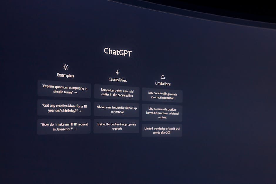
The most influential design decision OpenAI made was the one that looks like no decision at all: a blank text field at the center of the screen. No instructions. No templates. No getting-started checklist. Just a placeholder that says "Message ChatGPT."
This is the opposite of standard SaaS onboarding doctrine. Most products fill empty states with guidance: sample queries, category buttons, feature callouts. ChatGPT's empty state communicates something different. It says: you already know what to do. The interface assumes competence rather than explaining itself.
The suggestion chips below the input ("Summarise text," "Brainstorm," "Analyse data") arrived in later updates and represent a small concession to discoverability. But the core design philosophy held: the blank field came first, and the suggestions were additive, not foundational. This ordering matters. Products that lead with suggestions train users to browse. Products that lead with a blank field train users to think.
At 925Studios, we've found that AI products built for power users consistently outperform when they adopt the blank-field-first approach. The products that struggle are the ones that over-explain: they turn the empty state into a feature catalogue and then wonder why session depth is low.
Why does streaming text output change how users perceive AI quality?
ChatGPT streams its responses token by token, appearing to "type" in real time. This is not a performance optimization. It is a trust mechanism. Without streaming, a 10-second wait for a complete response feels like failure. With streaming, a 10-second response that begins appearing after 0.3 seconds feels fast.
Streaming text output solves three problems simultaneously. It reduces perceived latency by giving users something to read immediately. It signals that the model is "thinking," which manages expectations about response quality. And it gives users something to read and react to before the response is complete, which increases engagement and reduces abandonment during long outputs.
The pattern has since become so standard that interfaces without it feel broken. Perplexity, Claude, and Gemini all stream. Products that show a loading spinner and then display a wall of text feel dated by comparison. The streaming UX is now table stakes, but ChatGPT established it as the default when there was no template to follow. Not sure how to implement this in your own AI product? Get a free UX audit from 925Studios.
How does the model selector hide complexity without removing control?
By 2025, ChatGPT offered users access to multiple model capabilities: fast responses, reasoning-intensive "thinking" modes, and automatic selection. Rather than exposing this as a technical choice ("GPT-4o vs o3-mini"), OpenAI surfaced it as a behavioral choice: "Auto," "Fast," and "Thinking." Users select what they need from the output, not what they know about the underlying model.
This is a design pattern worth studying regardless of whether you're building an AI product. The principle is: expose capability through outcomes, not mechanisms. A user does not care which model processes their request. They care whether the response will be thorough or quick. Renaming the choice in terms of what the user gets, rather than how the system works, removes a cognitive barrier that otherwise requires technical context to cross.
The same principle applies to temperature settings, context window lengths, and other LLM parameters that most users should never see. ChatGPT consistently made the right call here: hide the mechanism, surface the outcome.
What does ChatGPT's conversation sidebar reveal about memory architecture in AI UX?
The left sidebar in ChatGPT stores previous conversations, organized by recency (Today, Yesterday, Last 7 Days). At first glance, this looks like a practical navigation pattern. On closer inspection, it reveals a deeper design intention: giving users a sense that the product remembers them.
The sidebar creates a mental model of accumulation. Each conversation is a record. Over time, the sidebar becomes a kind of external memory, a log of your thinking history with the model. This is psychologically meaningful in a way that tab-based navigation is not. It transforms a stateless model into a product that feels like it has a relationship with you.
The practical design lesson here is that conversation history should be treated as a feature, not a navigation element. The products that get this wrong organize history as a file system (folders, search, filters). The products that get it right organize history as a timeline with semantic groupings. ChatGPT got this mostly right, though its inability to search conversation history by content is a significant gap.
Yusuf breaks down this pattern in more detail on the 925Studios YouTube channel, including how to apply it for enterprise AI tools with team-level memory requirements.
What can you borrow from ChatGPT's interface for your own product?
The five patterns most worth adapting from ChatGPT's interface design are: the blank-field-first empty state, streaming text output, outcome-labeled model selectors, conversation timeline navigation, and the fixed-width response column. That last one is underrated. ChatGPT constrains its response area to roughly 65 characters per line, which is the optimal reading line length for dense text. Most AI products ignore this and let responses span the full viewport width, which creates readability fatigue on long outputs.
The pattern least worth copying is the generic sidebar label system. "New chat" is not a useful label. Products that allow users to name, tag, or organize conversations by project consistently report higher long-term retention than those that default to time-based groupings. ChatGPT introduced this limitation and most competitors copied it without questioning whether it was the right call.
When we design AI product interfaces at 925Studios, we start from ChatGPT's base patterns and then audit each one against the specific use case. A coding assistant has different conversation management needs than a writing tool. A team-facing product has different memory requirements than a personal tool. The template is a starting point, not a constraint.
What did ChatGPT get wrong, and how can you do better?
Three genuine weaknesses in ChatGPT's design are worth naming because most AI products have copied them without improvement.
Conversation search is absent. By 2026, a user with 500+ conversations in ChatGPT has no way to search within conversation content. They can search by title only, but ChatGPT doesn't auto-title conversations at launch. This creates a navigation failure at scale. Perplexity and Claude handle this better. If you're building a product that users will use daily for months, conversation search is not optional.
Trust signals for uncertain outputs are underdeveloped. ChatGPT provides no inline confidence indicators. When the model is generating a response that may be inaccurate, the interface gives no signal. The response flows with the same visual authority whether the model is highly confident or essentially guessing. Products like Perplexity improved on this by citing sources inline. Bing Copilot added explicit confidence labels. If your AI product is making claims in domains where errors have consequences, visual trust differentiation is a design requirement.
Onboarding assumes prior exposure. The blank field works well for users who have already used an AI assistant. For users encountering conversational AI for the first time, it is genuinely confusing. OpenAI never solved this gap. If your product targets users without prior AI experience (enterprise buyers, older demographics, non-technical users), you need a more structured first-session experience than ChatGPT provides.
Want to avoid these gaps in your product? Talk to our team and we'll review your current AI interface against these patterns.
Frequently Asked Questions
What makes ChatGPT's interface design so widely copied?
ChatGPT arrived as the first AI product at consumer scale, which meant its interface choices became defaults by market precedent rather than design consensus. The blank input field, sidebar conversation history, and streaming text output were practical solutions to novel problems. When 100 million users learned these patterns in two months, subsequent AI products copied them to reduce friction for users who already had ChatGPT mental models.
How does streaming text output affect user trust in AI interfaces?
Streaming text significantly reduces perceived latency and increases the sense that the model is "working." Research on loading states consistently shows that progressive disclosure of progress reduces abandonment. For AI products specifically, streaming also signals effort and thoroughness, which increases confidence in the output before the user has finished reading it.
What is the design philosophy behind ChatGPT's empty state?
The blank input field assumes user competence rather than guiding them through feature discovery. This philosophy, "if you are here, you already know why," creates a different user experience from the typical SaaS onboarding approach of tooltips, sample actions, and feature walkthroughs. It works for ChatGPT because the use case (ask a question, get an answer) is intuitive. Products with less obvious use cases need more scaffolding at the empty state.
How do AI products design for model selection without confusing users?
ChatGPT's approach of labeling model options by outcome ("Auto," "Fast," "Thinking") rather than by technical specification is the right pattern. Users do not have a mental model for the difference between GPT-4o and o3-mini. They do understand the difference between a quick answer and a thorough analysis. Outcome-based labeling removes the cognitive barrier of needing technical knowledge to make a useful choice.
What are the biggest design weaknesses in ChatGPT's interface?
The three most significant weaknesses are: no conversation content search (only title-based navigation), absent confidence signals for uncertain outputs, and an onboarding experience that assumes prior familiarity with conversational AI. All three are known gaps that most competing products have also failed to fix.
Is ChatGPT's interface design good for enterprise AI products?
The core patterns (streaming output, conversation history, blank-field input) work well for enterprise. The gaps become more significant at enterprise scale: no team-level conversation sharing, no role-based access to conversation history, weak audit trails, and no integration with organizational knowledge bases by default. Enterprise AI products need to extend the ChatGPT template significantly, not just copy it.
How has ChatGPT's design changed since launch?
ChatGPT's core layout has been remarkably stable since 2022. The major additions are: suggestion chips below the input (2023), custom GPTs (late 2023), Projects for conversation organization (2024), and the Auto/Fast/Thinking model selector (2025). The fundamental interaction model of a centered input field with streaming responses and a sidebar of history has not changed. That stability is itself a design signal about what works.
What AI product interfaces have improved on ChatGPT's design?
Perplexity improved on source citation and search-based AI responses. Claude improved on long-context handling and document upload UX. Linear's AI integration improved on contextual AI within a product workflow rather than a separate chat interface. The most significant improvements on ChatGPT's design tend to come from products that solve a specific use case rather than general-purpose assistants trying to replace ChatGPT directly.
Building an AI product? We design AI interfaces from first principles, not templates. Let's talk.
If you're building a product and want a second opinion on your UX, talk to 925Studios. We work with SaaS, fintech, healthtech, web3, and AI startups.
See our work or book a free 30-minute call.
Follow us on Instagram and YouTube for design breakdowns and case studies.


Let’s keep in touch.
Discover more about high-performance web design. Follow us on Twitter and Instagram.
