Phantom Wallet Design Breakdown: How Web3 Onboards Non-Crypto Users

925studios
AI Design Agency
Reviewed by Yusuf, Lead Designer at 925Studios
Phantom turned a Solana-only browser extension into one of the most used wallets in crypto, and it did it by treating design as the product, not the wrapper around the product. Most web3 wallets still hand a new user a 24-word seed phrase and a warning, then act surprised when that user never comes back. Phantom rebuilt the exact moments where people normally quit.
That is why it is worth studying line by line. Web3 wallets lose roughly 70% of users during onboarding (WEPIN, 2025), and retention falls below 1% after 30 days. A wallet that keeps growing inside those numbers is doing something with design that the rest of the category is not. At 925Studios we design web3 products for teams in the Solana ecosystem, and Phantom is the reference we point founders to when they ask what "good" looks like in a category famous for hostile UX.
TL;DR:
Phantom's real advantage is onboarding. It softens the seed-phrase moment that makes most wallet users quit.
Multichain is invisible by default. The wallet picks the network so the user does not have to think about chains.
Human-readable transactions turn a scary signature prompt into a plain-language preview of what leaves your wallet.
The visual system feels consumer-grade and calm, not engineered by developers for developers.
What to borrow: design the fear and failure moments first, not the happy path.
Quick Answer: Phantom is a multichain crypto wallet (Solana, Ethereum, Base, Polygon, Sui, Bitcoin and more) whose design advantage is onboarding and clarity. It reduces seed-phrase friction, auto-selects the right network, and shows human-readable transaction previews. The lesson for founders: design the anxious moments (setup, signing, errors) before you polish the happy path.
What does Phantom actually do, and why does its design matter?
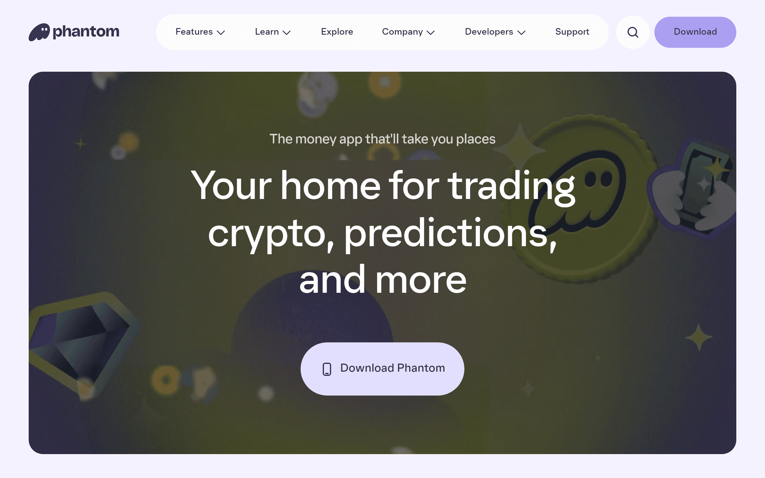
Phantom is a self-custody wallet that started Solana-first and is now multichain, spanning Solana, Ethereum, Base, Polygon, Sui, Monad, Bitcoin, and HyperEVM, with controls to switch networks on and off (Phantom, 2026). It runs as a browser extension and a mobile app, and it covers swaps, staking at around 6.88% APY on Solana, and NFT management in one place.
The design matters because the category it competes in is brutal to new users. When 70% of people abandon wallet setup and most dApps keep fewer than 20% of users past day seven, the wallet that wins is not the one with the most chains. It is the one a non-crypto person can actually finish setting up. Phantom optimizes for that person, and its market position reflects it.
Our honest take: the chains and the swap rates are not the moat. The moat is that Phantom decided its primary user is anxious and new, and designed for that person on purpose.
How does Phantom make wallet onboarding less terrifying?
The seed-phrase backup is the single most stressful screen in crypto. Users are handed a random 12 to 24 word phrase and told that losing it means losing everything, forever. That one moment is where a large share of the 70% drop-off happens. Phantom attacks it with plain language, one decision per screen, and approachable copy instead of cryptographic jargon.
It works because it respects how scared the user is. Progressive disclosure means a beginner is never shown ten concepts at once, and the wallet defaults the safe choice rather than asking the user to understand the tradeoff first. The industry data backs the direction: mobile-first apps using embedded, lower-friction onboarding report 30 to 40% higher completion (WEPIN, 2025).
The lesson for any product, not just web3: find the screen where your users are most afraid, and design that screen first. Struggling with a signup or activation flow that leaks users? We fix exactly this for SaaS and web3 teams.
Why does Phantom hide the multichain complexity?

Phantom supports a long list of chains, but the design choice that matters is that it does not make you care. Accounts have custom names and avatars, tokens and NFTs from every chain sit in one view, and the wallet connects to apps and selects the right network automatically, so you never manually switch chains.
This works because complexity that the system can absorb should never be handed to the user. A multichain wallet that forced people to pick networks would be technically impressive and practically unusable. Phantom treats the chain as an implementation detail, which is the same instinct great consumer software has always had.
What to learn: every toggle you remove from the user and resolve for them is a retention win.
How do human-readable transactions build trust?
Signing a transaction in most wallets means approving a wall of hex you cannot read. Phantom shows human-readable transactions, a simple preview of exactly what assets enter and leave your wallet before you approve. It turns a leap of faith into an informed yes.
This is trust designed into the interface, not bolted on with a security badge. In a space where one wrong signature can drain an account, showing consequences in plain language is the difference between a user who signs confidently and one who freezes. Trust earned at the moment of action is worth more than any homepage testimonial.
What makes Phantom feel consumer-grade instead of crypto-grade?
Phantom looks like a modern consumer app: calm spacing, a clear hierarchy, friendly avatars and account names, and restraint with color and density. It does not look like a block explorer. That visual calm signals safety, and safety is the entire job of a wallet's brand.
This is the hardest thing to copy and the easiest to underrate, because it is the sum of a hundred small decisions rather than one feature. At 925Studios we have designed web3 products for teams like Solana, Jupiter, and Offa, so we have shipped the exact onboarding and signing flows this breakdown praises, and the visual restraint is always the part founders are tempted to skip. See how that restraint plays out in our work.
What should you borrow from Phantom for your own product?
Borrow the order of operations. Phantom designed its scariest moments first: backup, signing, recovery, errors. Map your own product's fear moments and treat them as the primary design surface, not edge cases. Then default the safe path so the nervous user can succeed without understanding the tradeoffs, and write every label in plain language a newcomer would use.
Want a team that designs the anxious moments, not just the marketing screens? Book a free 30-minute call.
What did Phantom get wrong?
It is still seed-phrase based at the core. Phantom softens that moment beautifully, but it has not removed it the way embedded-wallet and social-login approaches now can, and that is a real ceiling on mainstream adoption. The growing list of chains and toggles also risks creeping complexity over time, where the very simplicity that made Phantom great gets buried under options. And some advanced actions sit deeper in the interface than power users would like. None of this undoes the craft, but pretending a product is flawless is how you stop learning from it.
Frequently Asked Questions
Is Phantom wallet safe to use?
Phantom is a self-custody wallet with biometric login and hardware-wallet support, and its human-readable transaction previews help users avoid malicious signatures. As with any self-custody wallet, safety still depends on the user protecting their seed phrase.
Which blockchains does Phantom support?
As of 2026 Phantom is multichain across Solana, Ethereum, Base, Polygon, Sui, Monad, Bitcoin, and HyperEVM, with controls to enable or disable networks (Phantom, 2026).
Why do most web3 wallets lose users during onboarding?
Roughly 70% of users drop off during wallet onboarding (WEPIN, 2025), mostly at seed-phrase backup and network setup. The jargon and the irreversible-loss warning create friction that newcomers abandon, especially on mobile.
What can SaaS and web3 founders learn from Phantom's design?
Design the fear moments first, absorb complexity instead of exposing it, and write in plain language. The same principles that keep Phantom's users from quitting apply to any onboarding or signup flow.
How much does it cost to get a web3 product designed properly?
It varies with scope, from a focused onboarding redesign to a full product build. The cheaper mistake is shipping a developer-grade interface that leaks 70% of users before they ever transact. Talk to 925Studios for a scoped estimate.
Related Articles
If Phantom proves anything, it is that in web3 the design is the trust. If you are building a product where users have to feel safe on the first screen, that is the work.
If you are building a web3, AI, or SaaS product and want a team that covers product design, motion, and founder video under one roof, talk to 925Studios. We are web3-native, with work across the Solana ecosystem including Solana, Jupiter, and Offa.
See our work or book a free 30-minute call.
Follow us on Instagram and YouTube for design breakdowns and case studies.

Let’s keep in touch.
Discover more about high-performance web design. Follow us on Twitter and Instagram.
