
Dec 22, 2025
Tips for Mastering Data Visualization UX for Better Insights
925 Studios
Effective data visualization transforms complex information into clear, actionable insights that users can understand at a glance. The key to mastering data visualization UX lies in prioritizing clarity over decoration, selecting the right chart types for your data, using purposeful color systems, and designing for accessibility. By following proven design principles—including visual hierarchy, responsive layouts, and interactive elements—you can dramatically improve how users comprehend and act on data. Start by understanding your audience's technical proficiency and needs, then apply iterative testing to refine your visualizations until they deliver maximum impact.
What Is Data Visualization UX and Why Does It Matter?
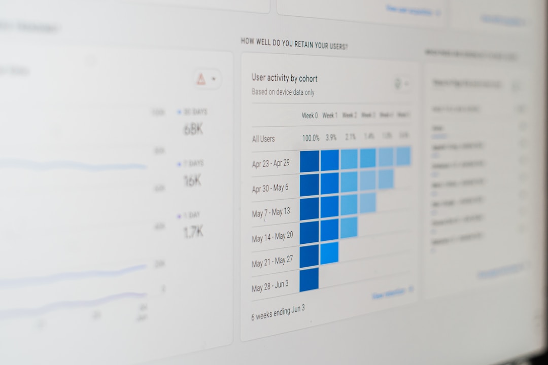
Data visualization UX is the practice of presenting complex data sets in visual formats—charts, graphs, heatmaps, and dashboards—that help users quickly comprehend patterns, trends, and relationships. Unlike static reports, effective data visualization UX prioritizes the user's ability to extract meaningful insights without cognitive overload.
In today's data-driven landscape, effective data visualization supports quick comprehension of complex information and reduces cognitive load through thoughtful layout design. This is especially critical for SaaS applications, where executives need high-level summaries while analysts require granular details to identify patterns. Poor visualization design—cluttered layouts, confusing color schemes, inaccessible interactions—can hide valuable insights and frustrate users. Mastering this discipline directly impacts product adoption, user engagement, and business decision-making.
How to Choose the Right Chart Type for Your Data
The foundation of great data visualization UX is selecting the appropriate chart type. Different visualization formats serve different purposes, and choosing incorrectly can obscure rather than clarify your data.
Line graphs: Best for visualizing trends over time. Use these when you need to show continuous change or patterns across a timeline.
Bar charts: Excellent for numerical comparison between discrete categories. They work well for showing performance metrics, rankings, or categorical breakdowns.
Scatter plots: Ideal for identifying correlations and relationships between two variables. These are invaluable for exploratory data analysis.
Heatmaps: Powerful for revealing patterns in large datasets by using color intensity to represent values. Great for matrix data or geographic distributions.
Pie charts: While popular, these are often misused. Reserve them only for part-to-whole relationships with very few categories (3–4 maximum).
The principle here is simple: the best designs are often the simplest—avoid excessive chart elements and focus on displaying the most important data effectively. Test different chart types with your target audience and measure comprehension to validate your choice.
Master Color Usage to Enhance Clarity and Accessibility
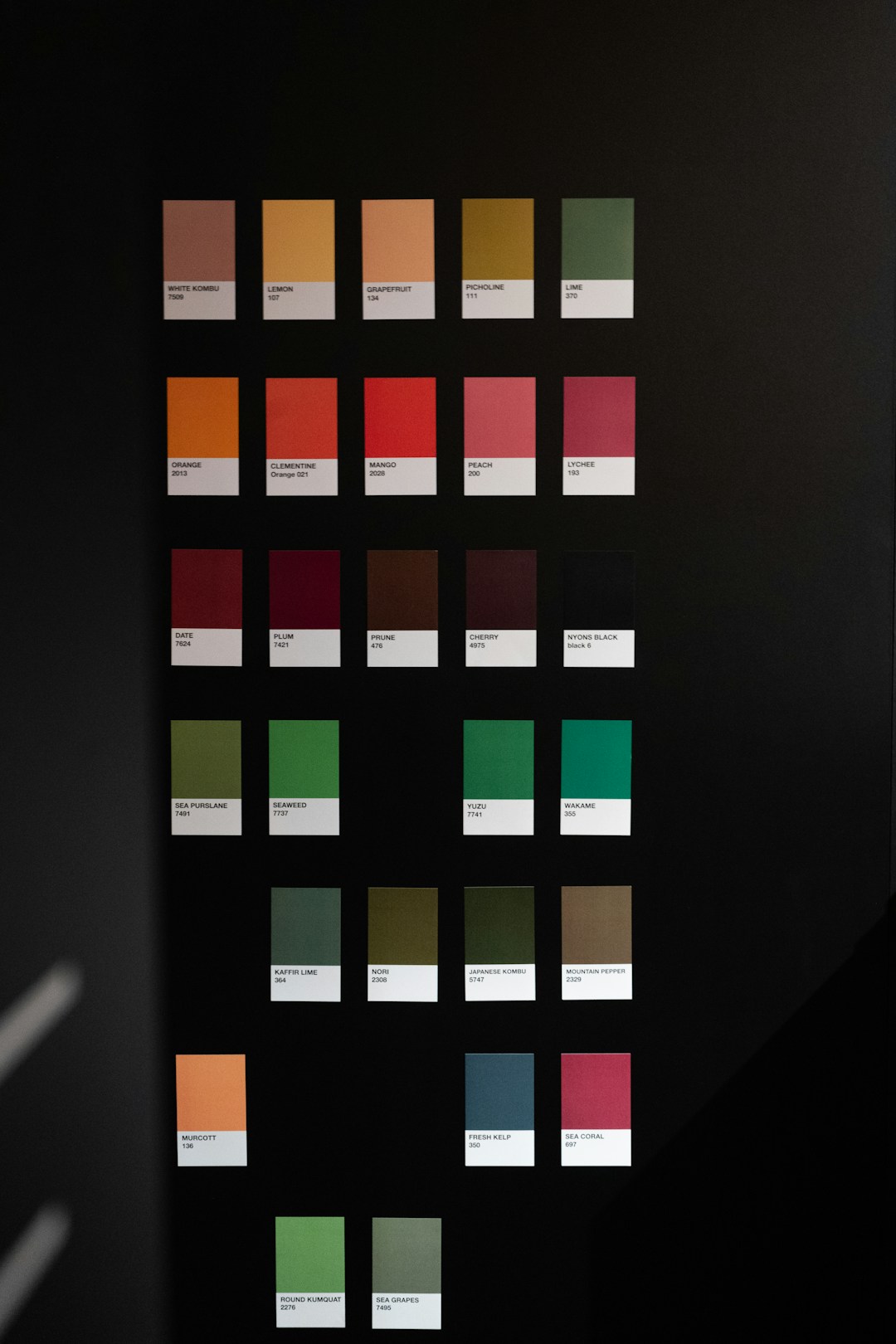
Color is one of the most powerful tools in data visualization, but it's also one of the most frequently misused. Poor color choices can create false patterns, reduce accessibility for colorblind users, and overwhelm viewers.
Key principles for effective color usage include:
Purpose-driven palettes: Choose colors that encode meaning (e.g., red for negative values, green for positive) rather than for decoration. Color can dramatically increase the visibility of insights when used well, but when used carelessly, it can clutter your chart.
Contrast and readability: Ensure sufficient contrast between background and foreground elements so data stands out clearly.
Colorblind-friendly schemes: Use tools like ColorBrewer to select palettes that work for all users, including those with color vision deficiencies.
Limited color range: Restrict your palette to 3–5 primary colors plus neutrals. Too many colors fragment attention and reduce impact.
Testing your color choices with both sighted and colorblind users ensures your visualizations are truly accessible and maintain clarity across all audiences.
Design for Different User Types and Technical Proficiency
Users bring different levels of technical expertise and different goals when viewing data. A well-designed data visualization UX accommodates this diversity.
Executives: Prefer high-level dashboards with simple, summarized visuals that highlight key performance indicators and trends at a glance.
Analysts: Need granular, detailed visualizations like scatter plots and heatmaps to uncover patterns and conduct exploratory analysis.
Operational users: Want focused dashboards that support immediate decision-making and action.
Consider implementing adaptive UIs that dynamically adjust visualization complexity based on user role and preference. This ensures novices aren't overwhelmed by unnecessary details while experts can drill down into deeper insights when needed. Progressive disclosure—revealing advanced options only when requested—keeps your interface clean while maintaining power for experienced users.
Implement Visual Hierarchy and Clear Labeling
Visual hierarchy determines what users notice first and guides their eye through your visualization. Without clear hierarchy, even well-designed charts become confusing.
Best practices include:
Emphasis on key metrics: Use size, color, and position to draw attention to the most important data points or trends.
Clear labels and legends: Labels should be descriptive without technical jargon, ensuring all users can understand what they're viewing.
Meaningful titles: Use descriptive titles that tell the user what the visualization shows and why it matters.
Reduce "chart ink": Remove gridlines, borders, and decorative elements that don't directly support data comprehension. Every element should earn its place.
Consistent formatting: Maintain consistent fonts, sizes, and styling across all visualizations in your product to reduce cognitive friction.
Testing with real users reveals whether your visual hierarchy is working as intended. Eye-tracking studies and user interviews can validate that viewers understand the data in the order and way you intended.
Build Interactivity and Responsiveness Into Your Designs
Static visualizations have limitations. Interactive elements empower users to explore data, ask questions, and discover insights independently.
Consider adding:
Hover tooltips: Display detailed values when users hover over data points, reducing clutter while providing depth.
Filtering and drill-down: Allow users to filter by categories, time ranges, or other dimensions to focus on relevant data subsets.
Responsive design: Ensure visualizations adapt across different screen sizes and devices so users can access insights from desktop, tablet, or mobile.
Zoom and pan: For large datasets, enable users to zoom into detail areas and pan across the visualization.
Comparative views: Allow side-by-side or overlay comparisons of different time periods or data segments.
Performance matters: ensure interactive features don't slow down your application. Optimize data loading, use virtualization for large datasets, and test performance across devices.
Prioritize Accessibility in Data Visualization
Accessibility isn't an afterthought—it's a core principle of effective data visualization UX. Accessibility ensures that everyone, regardless of ability, can interpret your visualizations; it's both a best practice and a moral imperative.
Key accessibility considerations include:
Alt text for charts: Provide descriptive alt text that summarizes the key insights and data for users relying on screen readers.
Colorblind-safe palettes: As mentioned earlier, use accessible color schemes that work for all vision types.
Keyboard navigation: Ensure all interactive elements are keyboard accessible for users who can't use a mouse.
High contrast: Maintain sufficient contrast between text and background (WCAG AA minimum: 4.5:1 for text).
Data tables as fallback: Provide underlying data in table format for users who can't access the visual representation.
Regular testing with assistive technology users and accessibility audits help identify and fix barriers before they impact your users.
Test and Iterate Your Visualizations
The best data visualization designs emerge through testing and refinement. Don't rely on assumptions about what will work for your users.
Effective testing approaches include:
User testing: Watch real users interact with your visualizations and observe where they struggle or succeed.
A/B testing: Compare different chart types, color schemes, or layouts to measure which performs better for your audience's comprehension.
Eye-tracking studies: Understand exactly where users focus their attention and in what sequence.
Accessibility audits: Use automated tools and expert review to identify accessibility issues.
Analytics tracking: Monitor which dashboard features users interact with most, revealing whether your design aligns with actual usage patterns.
Iterate based on what you learn. Small refinements—adjusting colors, repositioning elements, simplifying labels—can significantly improve comprehension and user satisfaction.
How 925Studios Approaches Data Visualization UX Design
925Studios specializes in crafting high-performance data visualization interfaces for SaaS, fintech, healthtech, and AI products. Our approach combines user research, design strategy, and rigorous testing to create dashboards and visualizations that drive user adoption and business outcomes.
We begin every data visualization project by understanding your users—their roles, technical proficiency, and decision-making needs. Rather than building generic dashboards, we design adaptive interfaces that serve executives, analysts, and operators with clarity tailored to their expertise level. Our design process emphasizes accessibility from the start, ensuring color schemes, interactive elements, and responsive layouts work seamlessly across all users and devices.
We've helped fast-growing SaaS and fintech companies reduce user onboarding time by 40% and increase feature adoption by redesigning their data visualizations for clarity and intuitive interaction. Our work combines world-class UX thinking with premium visual design, resulting in dashboards that feel modern, perform at scale, and help products grow.
If you're building a SaaS or AI product that relies on data insights, connect with 925Studios to explore how strategic data visualization UX can transform user engagement and business metrics.
Key Takeaways: Mastering Data Visualization UX
Prioritize clarity over decoration: Every visual element should serve a purpose. Remove complexity that doesn't enhance understanding.
Choose the right chart type: Match your visualization format to your data type and the insights you want to highlight.
Use color strategically: Apply purpose-driven color palettes that enhance meaning and ensure accessibility for colorblind users.
Design for your audience: Adapt visualization complexity to match user roles and technical proficiency.
Build interactivity thoughtfully: Add filtering, drill-down, and exploration features that empower users without overwhelming them.
Make accessibility non-negotiable: Ensure your visualizations work for all users, including those with color vision deficiencies or reliance on assistive technology.
Test obsessively: Use user testing, A/B testing, and analytics to validate that your visualizations deliver the insights users need.
Ready to Master Data Visualization UX?
Building world-class data visualization requires expertise in UX design, visual design, and technical implementation. Whether you're designing a new dashboard, refactoring an existing one, or scaling visualizations across your product, the right partner makes all the difference.
Book a call with 925Studios today to discuss how strategic data visualization UX can improve user adoption, reduce cognitive load, and unlock deeper insights across your SaaS, AI, or fintech product. Our team has shipped dashboards for leading startups and enterprises—let's build something exceptional together.
Sources


Let’s keep in touch.
Discover more about high-performance web design. Follow us on Twitter and Instagram.
