AI Slop Fonts and Gradients: The Tells That Give Away AI Design

925studios
AI Design Agency
Reviewed by Yusuf, Lead Designer at 925Studios
The fastest way to spot an AI-designed website in 2026 is the font and the gradient. AI slop design has a fingerprint: the Inter typeface, an indigo-to-purple gradient, three rounded cards in a row, and a hero section that could belong to any of ten thousand other products. None of these choices are bad on their own. The problem is that they are not choices at all. They are the statistical default a model reaches for when nobody told it to do anything else.
TL;DR:
AI slop design is the look you get when a model fills in taste decisions you did not make: Inter font, purple gradient, three cards, rounded corners.
The cause is statistical, not aesthetic. LLMs return the median of their training data, and the median web design since 2019 was Tailwind's default palette.
Tailwind's creator publicly apologized for making indigo-500 the default that every AI tool now copies.
The tells are not ugly, they are generic, and generic is worse than ugly because it makes your product forgettable.
The fix is constraint: give the model real brand decisions to work inside, or make them yourself.
Quick Answer: AI slop design is the generic look produced when AI tools default to the same patterns: the Inter font, blue-to-purple gradients, three rounded cards, and identical hero layouts. It happens because large language models generate the statistical average of their training data rather than making deliberate design choices. The fix is giving the model specific brand constraints, or making the taste decisions yourself instead of accepting the default.
What does AI slop design actually look like?

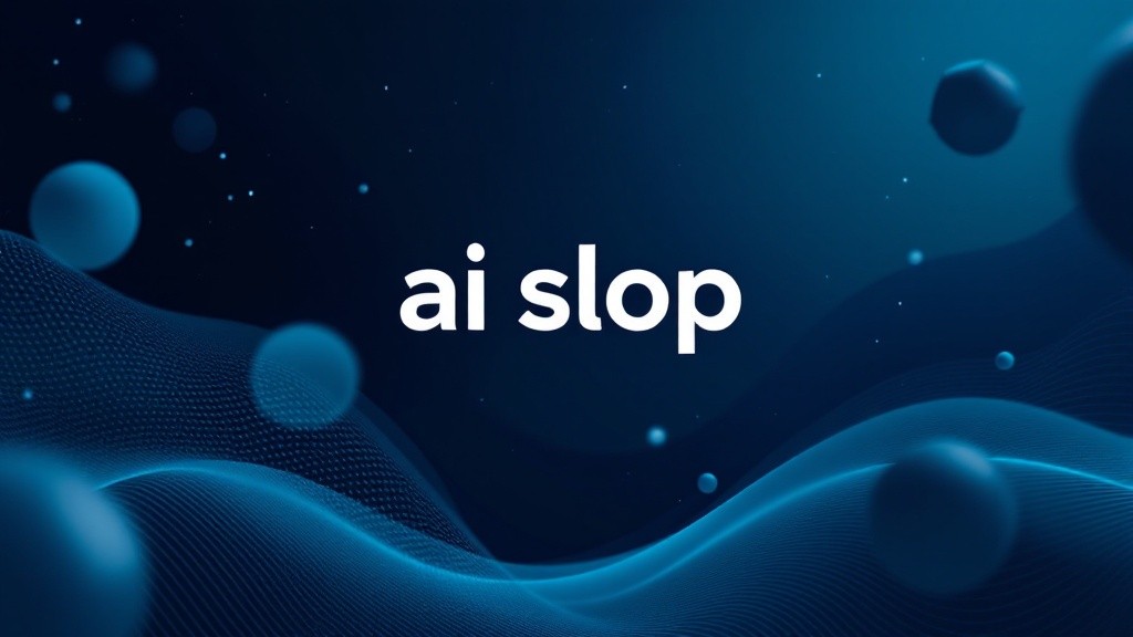
You have seen it even if you did not have a name for it. A landing page opens with a dark hero, a blue-to-purple gradient behind the headline, the Inter font set in a tight modern weight, and below it three feature cards with rounded corners and soft shadows, evenly spaced. The icons are thin-line and slightly generic. There is a gradient button that says "Get Started." It looks clean. It looks competent. And it looks exactly like the last four products you visited, because every one of them came out of the same set of AI tools reaching for the same defaults. At 925Studios, we call this the median aesthetic, and it is the single biggest design problem of the AI era, not because it is broken, but because it is invisible.
The tells are specific and worth naming, because once you see them you cannot unsee them. The Inter font, used everywhere, is not wrong, it is just the safest possible answer. The indigo gradient is not ugly, it is just the one a model has seen ten million times. The three-card row is not a bad layout, it is just the one Tailwind tutorials used, which means it is the one the model learned. Building something and worried it looks like everything else? We fix generic interfaces for product teams weekly.
Why do AI-built websites all look the same?
AI-built websites look identical because large language models are statistical pattern matchers, not designers, and when you ask one to build a landing page without specific constraints, it returns the median of every example in its training data. The most common pattern since 2019 was Tailwind CSS, and Tailwind's default starting color was indigo-500, which appeared in the training corpus far more than any other choice (Manish Kumar, X, 2026). The model did not decide purple gradients were good. It learned that purple gradients are statistically normal, and normal is what a model produces when left to its own defaults. Every Claude Code and Codex user pulling from that same training data gets back the same median output, which is why the entire web started to converge on one aesthetic the moment AI tools went mainstream. This is not a bug in any single tool. It is what averaging looks like when everyone averages from the same source.
Tailwind's creator, Adam Wathan, said it out loud. He joked that he would "like to formally apologize for making every button in Tailwind UI bg-indigo-500 five years ago, leading to every AI generated UI on earth also being indigo." It is a joke with a real mechanism behind it. A design choice that one influential framework made in 2019 became the default that millions of tutorials copied, which became the dominant pattern in the training data, which became the thing every AI model now reaches for first. You are not looking at a trend. You are looking at a feedback loop, and it tightens every time a purple-gradient site gets enough attention to make it back into the next round of training data.
Why is generic worse than ugly?

Most founders worry about their product looking bad. In 2026, that is the wrong fear. A genuinely ugly website is at least memorable and occasionally even charming, because someone clearly made a choice. A generic website is forgettable, and forgettable is fatal for a startup that needs a user to remember it after one visit. When your product looks like the statistical average of every other AI tool, you inherit a specific problem: a visitor cannot tell you apart from the competitor they saw an hour ago, so the design does none of the work of building recognition or trust. We have watched this play out across the products we review at 925Studios, where the issue is almost never that the design is bad. It is that the design is anonymous. For an AI product especially, an anonymous interface quietly signals that you accepted whatever the model produced, which is exactly the opposite of the message a company built on a differentiated model wants to send.
Our honest take: looking like everyone else is a worse outcome than looking slightly rough, and most founders have the risk backwards. They polish their way into the median because the median feels safe. It is not safe. It is the most crowded position on the internet. The brands people remember took a position the model never would have: a real typeface with a point of view, a color that means something, a layout that breaks the three-card reflex. Worried your product blends into the AI-built crowd? See how we make products look like themselves.
Why is AI slop getting worse instead of better?
You would expect the problem to fade as the tools improve, and it is doing the opposite, because the mechanism feeds itself. When a striking site with a purple gradient gets enough attention, it makes its way into the next round of training data, which teaches the next generation of models that purple gradients are even more normal than before. Design choices that were once fresh become instant signals that you accepted whatever the model produced, and the window between "distinctive" and "default" keeps shrinking. A pattern that looked original in early 2025 was a cliche by mid-2026, not because taste moved, but because the feedback loop digested it. Every cycle, the median gets more confident and more homogeneous, and the tools get better at producing it cleanly. The output is more polished slop, which is arguably worse, because polished slop is harder to recognize as slop.
This is the part conventional wisdom gets wrong. The common assumption is that better models mean better design, and for raw execution that is true: the code is cleaner and the layouts are tighter than they were a year ago. But execution quality and distinctiveness are different axes, and improving one does nothing for the other. A model can render the median aesthetic more beautifully every quarter while making every product that uses it look more alike, not less. The teams who understand this stopped waiting for the tools to develop taste, because taste is not on the roadmap for a system whose entire job is to predict the most likely next token. The most likely next thing is, by definition, the average thing. You cannot prompt your way to distinctive by asking an averaging machine to be original.
Not sure whether your design reads as distinctive or default? Get an honest review from 925Studios.
What are the specific tells that give away AI design?
The font: Inter everywhere
Inter is a genuinely excellent typeface, which is exactly why it became the default and exactly why it now reads as generic. When a model picks a font with no brand direction, it picks Inter, because Inter is the most-used interface font in its training data. The tell is not that Inter is bad, it is that Inter unchosen signals nobody made a typography decision. A product with a real point of view picks a typeface that carries a feeling, or pairs Inter with something that does.
The color: indigo-to-purple gradients
The blue-to-purple gradient is the single loudest AI tell in 2026. It traces directly back to Tailwind's indigo-500 default and the training-data feedback loop it created. A gradient is not the problem. An unchosen gradient in the exact hue every model defaults to is the problem. The fix is a deliberate palette built from something true about the product, not the color the model reaches for when no one is steering.
The layout: three rounded cards in a row
Open almost any AI-generated landing page and you will find a row of three feature cards, rounded corners, soft shadow, thin-line icon at the top of each. It is the layout Tailwind tutorials used to demonstrate a grid, so it is the layout the model learned as "how a feature section looks." Breaking this single reflex, with asymmetry, a different rhythm, or content that does not fit a neat triptych, does more to de-slop a page than almost anything else.
The copy and icons: confident and weightless
The visual tells travel with verbal ones. AI-built pages tend toward weightless headline copy ("Build faster. Ship smarter.") and a set of thin, interchangeable line icons that could illustrate any product. Together they complete the effect: a page that is grammatically and visually correct and says nothing specific about who it is for. The cure is the same as for the visuals, a real decision where the model left a default.
Yusuf breaks down how to strip these tells out of an AI-built site in a video on the 925Studios YouTube channel.
Which products prove you can escape the AI aesthetic?
The products people actually remember in 2026 are the ones that made the decisions a model would have defaulted past, and they are worth studying because they show the slop is a choice, not a fate. Linear built an entire identity on restraint and a precise, custom-feeling type and color system that no AI tool would ever generate, and the result is a product that is instantly recognizable from a single screenshot. Stripe has spent a decade making deliberate typographic and color decisions that read as Stripe and nothing else, which is why its design gets copied rather than averaged. Duolingo committed to a loud, character-driven visual language that breaks every "clean SaaS" default and is unmistakable in a crowded app store. None of these products look like the median, because at every fork where a model would have reached for Inter and a gradient, a human reached for something that meant something instead.
The lesson is not "copy Linear," because copying Linear is just a more sophisticated way to land in a different median. The lesson is that distinctiveness comes from making the decision rather than inheriting it. Each of these products picked a typeface, a palette, and a structural rhythm that expressed a specific point of view, and then held that decision consistently across every surface. That consistency is the part AI tools cannot give you on their own, because a model has no memory of your brand between one prompt and the next. It will happily re-default to purple on the page you generate tomorrow. Holding a real design decision across an entire product is human work, and it is precisely the work that separates a memorable product from a forgettable one. We break down exactly these kinds of decisions in our design breakdowns and case studies.
How do you avoid shipping AI slop?
The cure for AI slop is constraint, because the slop comes from absence, the absence of any decision the model was forced to respect. When you prompt a tool to "build a landing page," you are handing it every taste decision at once, and it will fill all of them with the median. When you instead give it a real typeface, a specific palette drawn from your brand, a layout principle, and a tone, you have moved the decisions back to where they belong and the model becomes a fast executor instead of a taste-maker. The teams shipping distinctive work with AI in 2026 are not avoiding the tools. They are constraining them, feeding them actual brand direction and treating the output as a draft to be pushed past the default rather than a finished page to be accepted. The model is genuinely useful once you stop letting it decide the things that make your product yours.
If you cannot give the model that direction yet, that is the real signal, and it is not a design problem you can prompt your way out of. It means the brand decisions have not been made, and no tool can make them for you, because they are decisions about what your product means, not what it looks like. This is the part founders try to skip and the part that actually matters. Across the products we ship at 925Studios, design, motion, and brand stay under one team precisely so those decisions get made once, deliberately, and then carried consistently across every surface instead of being re-defaulted by a different tool on every page. Want a team that makes the decisions a model never will? Book a free 30-minute call.
A practical place to start, if you are doing it yourself, is to audit your own product against the four tells. Open your landing page and ask honestly: is the font chosen or defaulted, is the gradient meaningful or median, does the layout break the three-card reflex anywhere, and does the headline say something only your product could say. If the answer to most of those is "defaulted," you have not been designed, you have been averaged, and a visitor will feel that even if they cannot name it. Fixing even one of the four, a real typeface or a palette with intent, pulls a page noticeably out of the slop. Fixing all four is what makes a product look like it was built by a company that knows who it is.
Frequently Asked Questions
What is AI slop design?
AI slop design is the generic, interchangeable look produced when AI tools default to the same patterns: the Inter font, blue-to-purple gradients, three rounded cards, and identical hero layouts. It happens because models generate the statistical average of their training data instead of making deliberate design choices.
Why do AI websites always use purple gradients?
Because Tailwind CSS shipped indigo-500 as its default color in 2019, and Tailwind became the most common framework in the training data AI models learned from. The model reaches for indigo-to-purple gradients because they are statistically the most normal choice it has seen, not because they are the best one.
Is the Inter font bad?
No. Inter is an excellent, highly readable interface typeface. The issue is not the font, it is that a model defaults to Inter when no typography decision was made, so an unchosen Inter signals a generic, AI-built page. Used deliberately or paired with a distinctive face, it is a fine choice.
How can I tell if a website was built by AI?
Look for the cluster of tells together: Inter font, an indigo-to-purple gradient, a row of three rounded feature cards with thin-line icons, weightless headline copy, and a hero that could belong to any product. Any one of these is fine alone. All of them together is the AI fingerprint.
Is generic design worse than ugly design?
For a startup, usually yes. Ugly design is at least memorable and shows a human made a choice. Generic design is forgettable, which means it does none of the work of building recognition or trust. A visitor who cannot tell you apart from a competitor will not remember you.
Can AI tools make non-generic websites?
Yes, but only when you constrain them. Give an AI tool a specific typeface, a real palette, a layout principle, and a tone, and it becomes a fast executor of your decisions. Prompt it with "build a landing page" and no direction, and it will return the median every time.
Why do all AI-built sites use three cards in a row?
Because Tailwind tutorials commonly used a three-column card grid to demonstrate layout, so the model learned that pattern as the default way a feature section looks. Breaking the three-card reflex with asymmetry or a different rhythm is one of the fastest ways to make a page feel less AI-made.
Do I need a designer if AI can build my site?
If you want your product to look like itself rather than the statistical average, yes. AI tools cannot make the brand decisions that differentiate you, because those are decisions about meaning, not appearance. A designer makes the choices the model defaults past, and then the tools can execute them quickly.
If your product looks like every other AI-built site and you want it to look like itself, talk to 925Studios.
Related Articles
AI Slop Web Design: Complete Guide to Spotting and Fixing Generic Websites
AI Can Build Your Product. Here's Why You Still Need a Designer.
AI Product UX Design: Patterns, Trust and Interface Guidelines
If you're building a product and want a team that covers product design, motion, and founder video under one roof, talk to 925Studios. We work with SaaS, fintech, healthtech, web3, and AI founders.
See our work or book a free 30-minute call.
Follow us on Instagram and YouTube for design breakdowns and case studies.

Let’s keep in touch.
Discover more about high-performance web design. Follow us on Twitter and Instagram.
